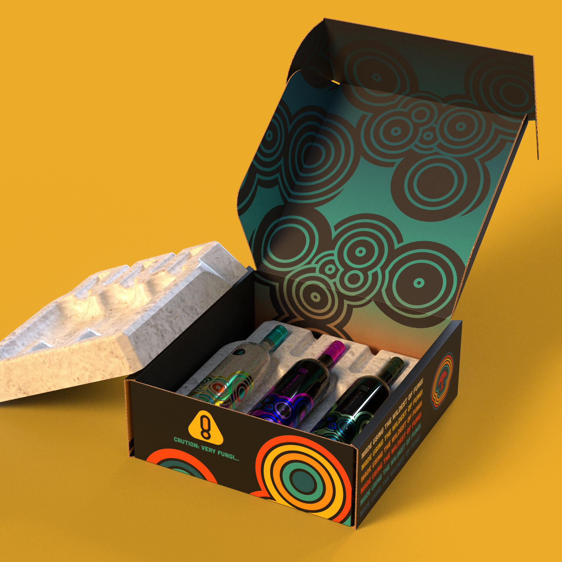
In this project, we collaborated with Ecovative which specializes in developing mushroom-based packaging as an eco-friendly alternative to plastic. For this collaboration, we decided to make a wine company that was mushroom themed and promoted the use of mushroom-based packaging that is in the form of a wine carrier, to which I came up with the idea of Wild & Fungi.
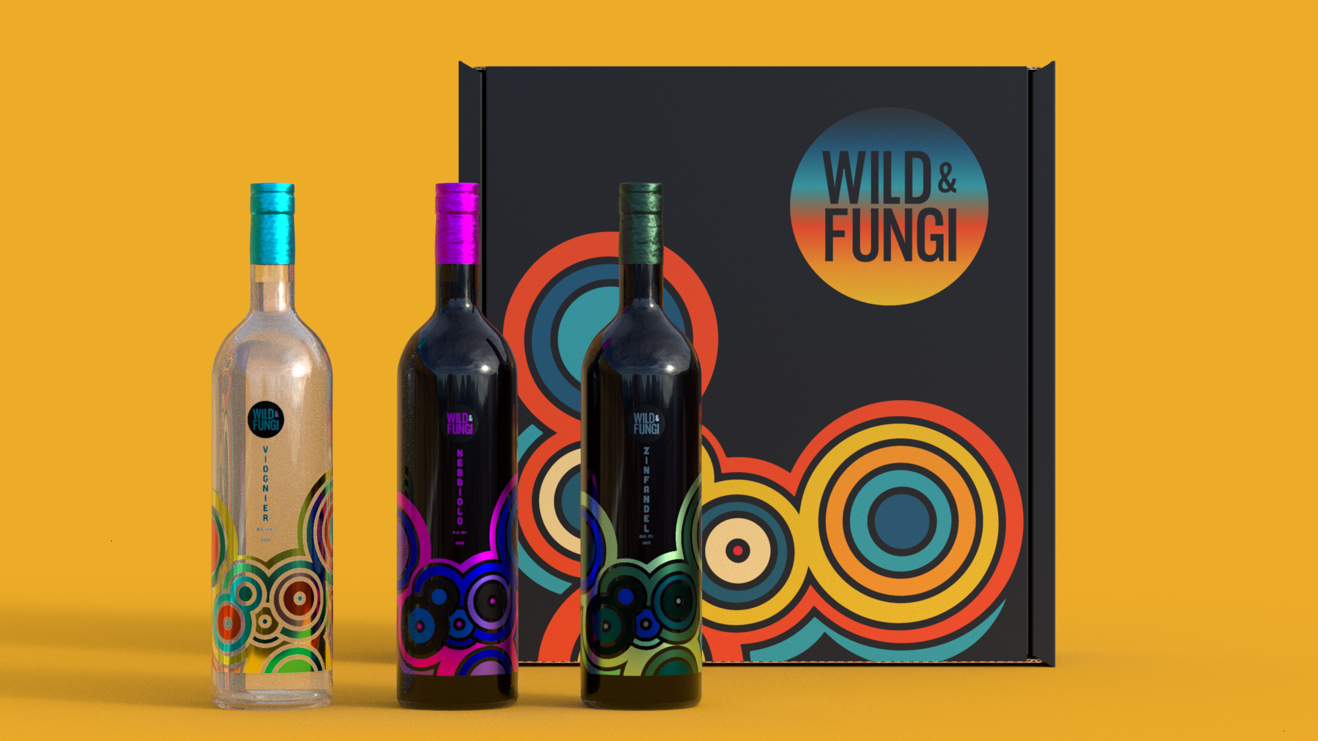
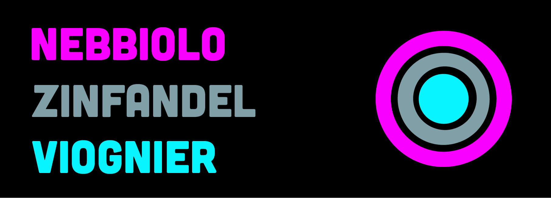
The design theme that I was aiming for was a "retro vintage party feeling." The wines I decided to go with were: Viognier, Nebbiolo, and Zinfandel as they have been known to pair very well with mushrooms in food and I personally thought the names were weird and fit the theme of mushrooms.
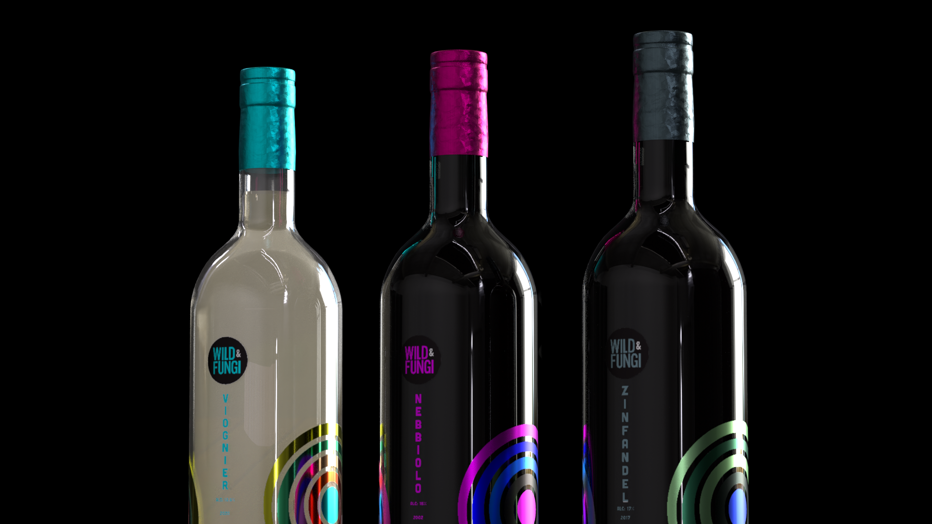
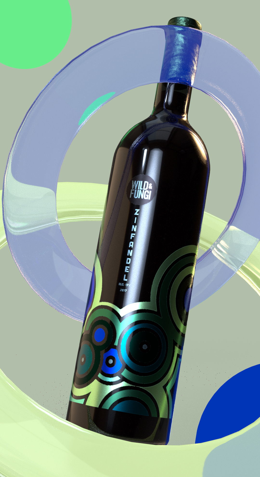
I wanted the bottles to be elegant, but have a funky colorful design that is reminiscent of growing spores. The colors I chose were meant to complement each respective type of wine based on their flavor and ingredients.
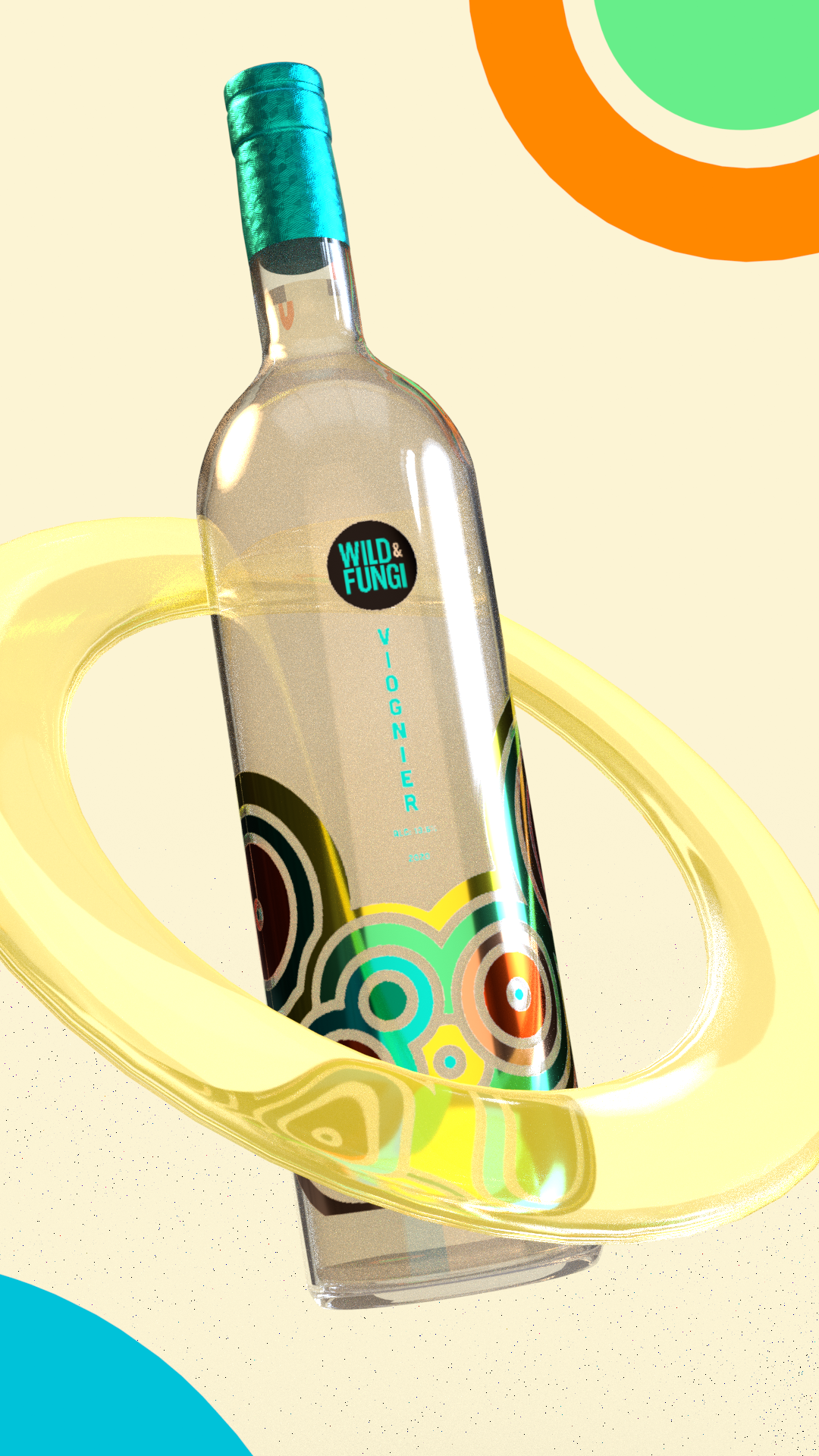
Viognier is a white wine, so I wanted to aim for a soft color palette that reminds me of the beach.
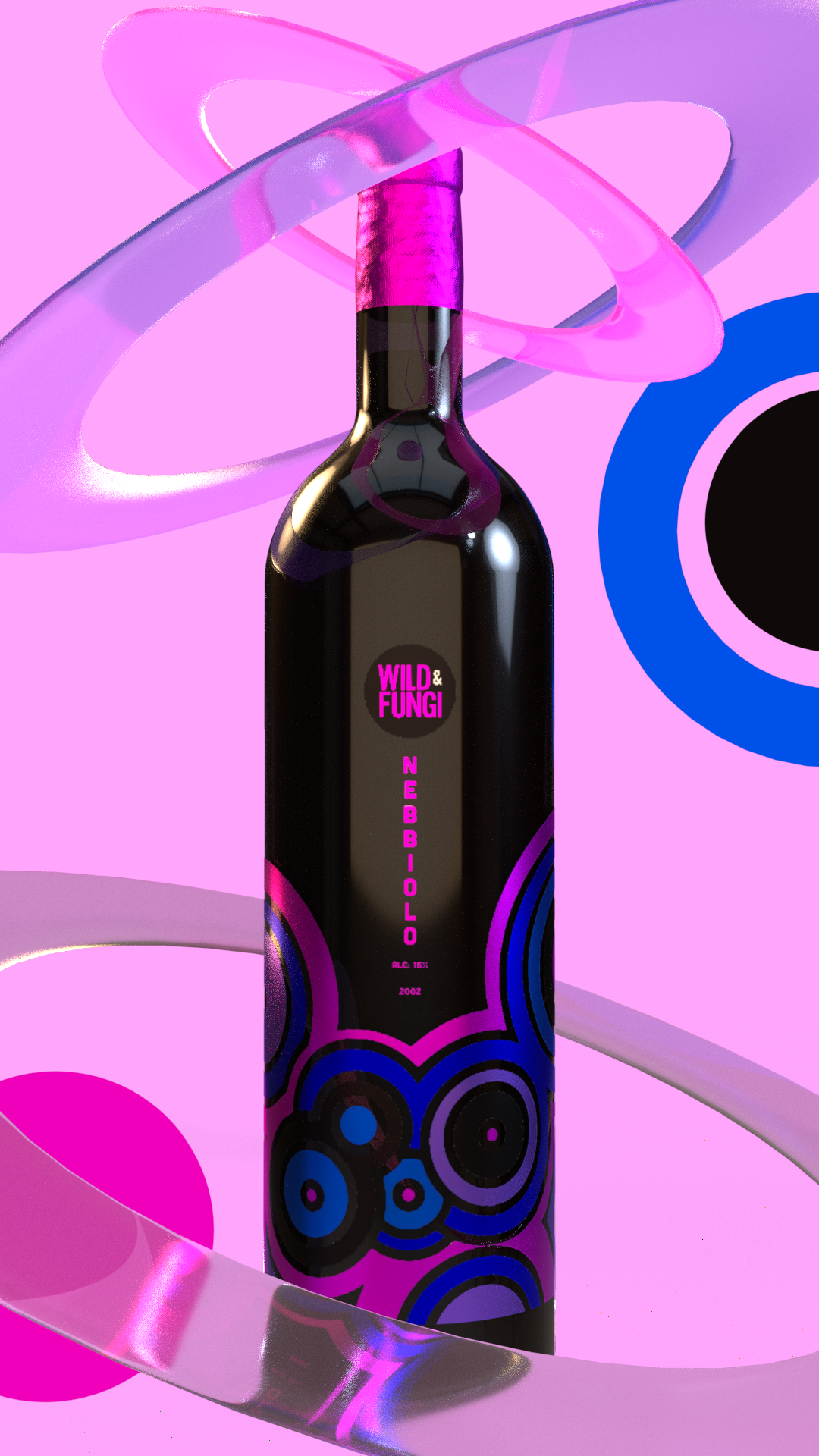
Nebbiolo is a red wine, so I wanted to aim for a bold and vibrant palette that gives a mature taste.
Zinfandel is a red wine, I wanted to aim for a soft and subtle palette that gives a neutral feeling to any setting.
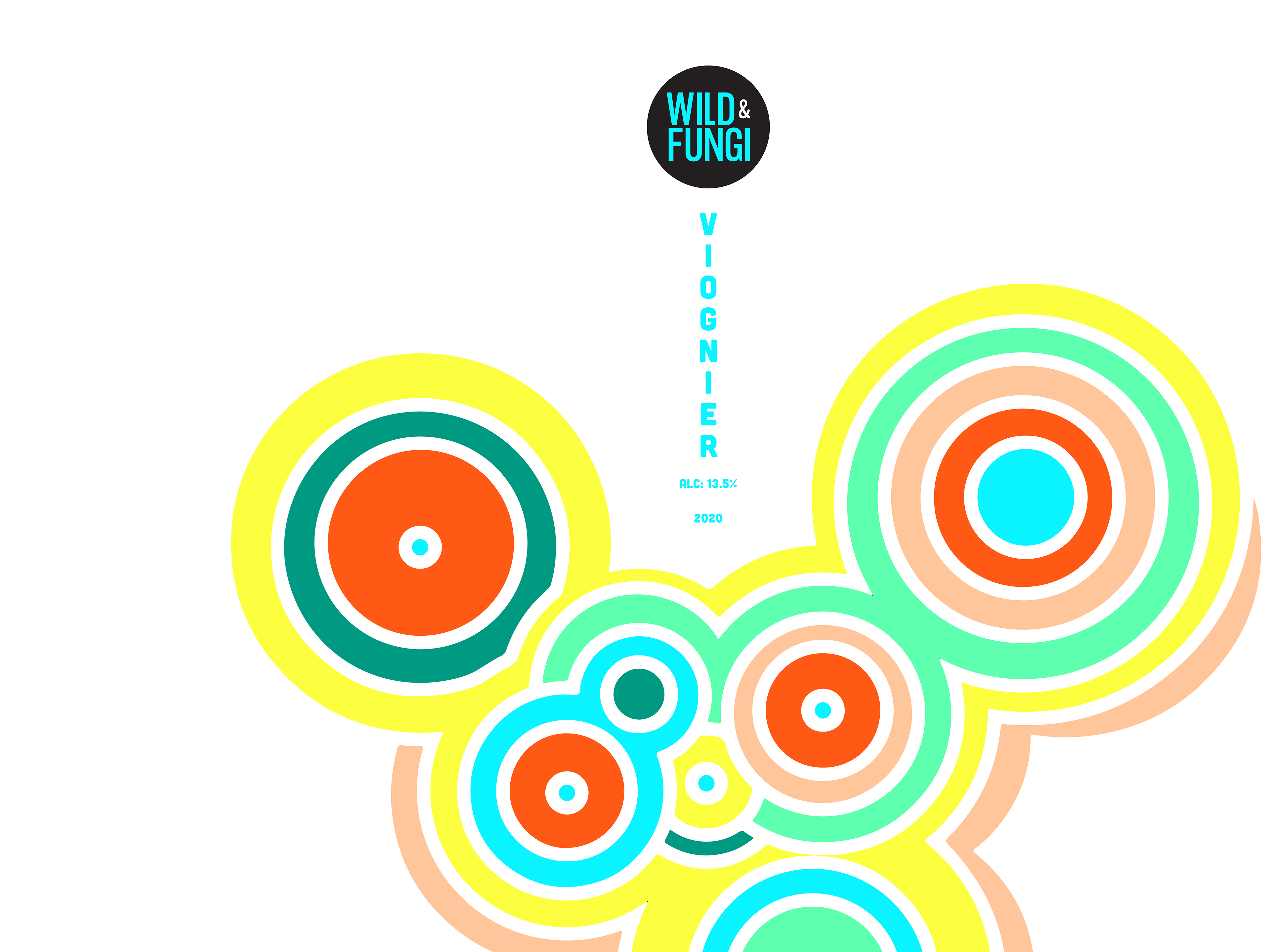
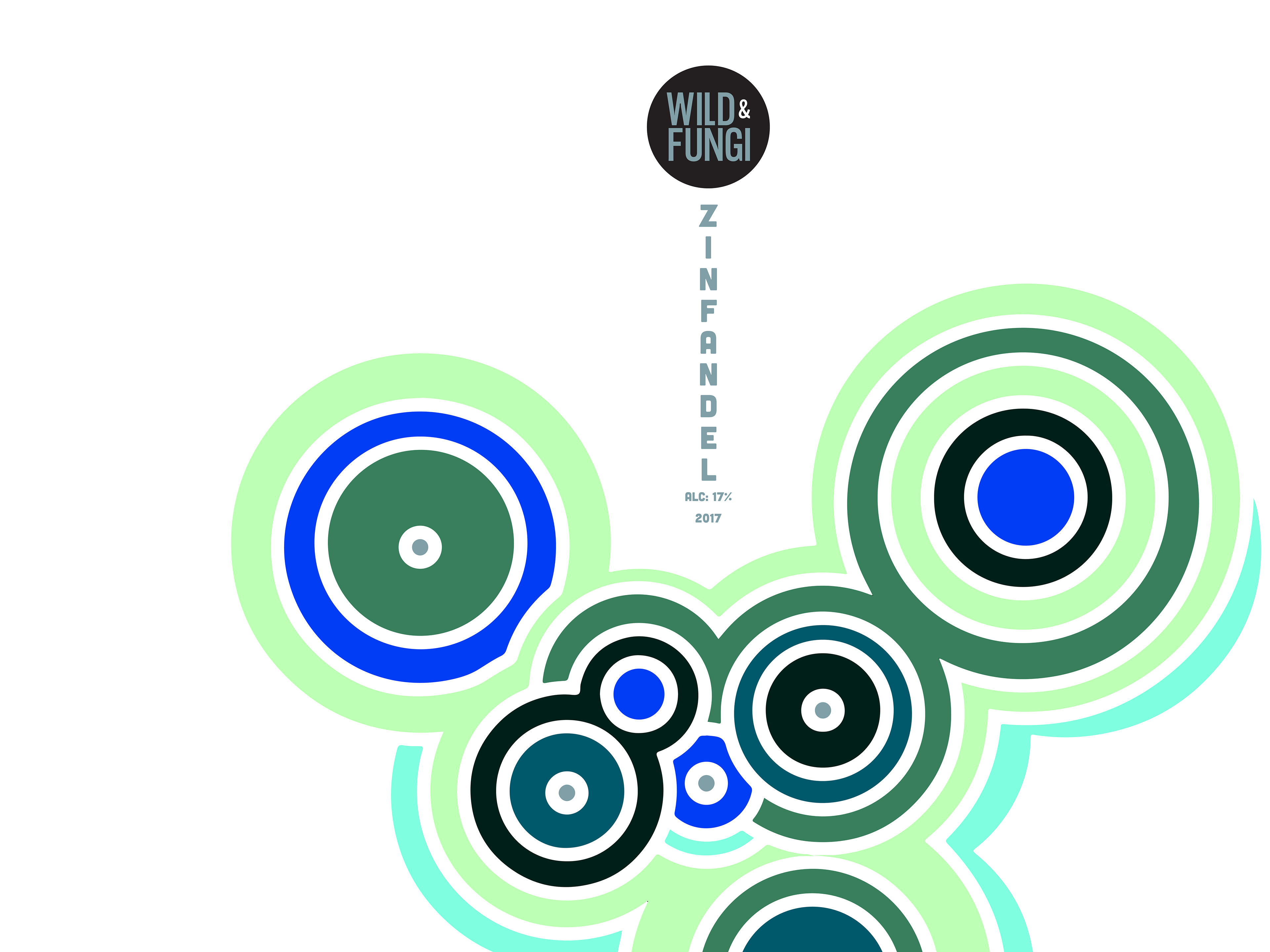
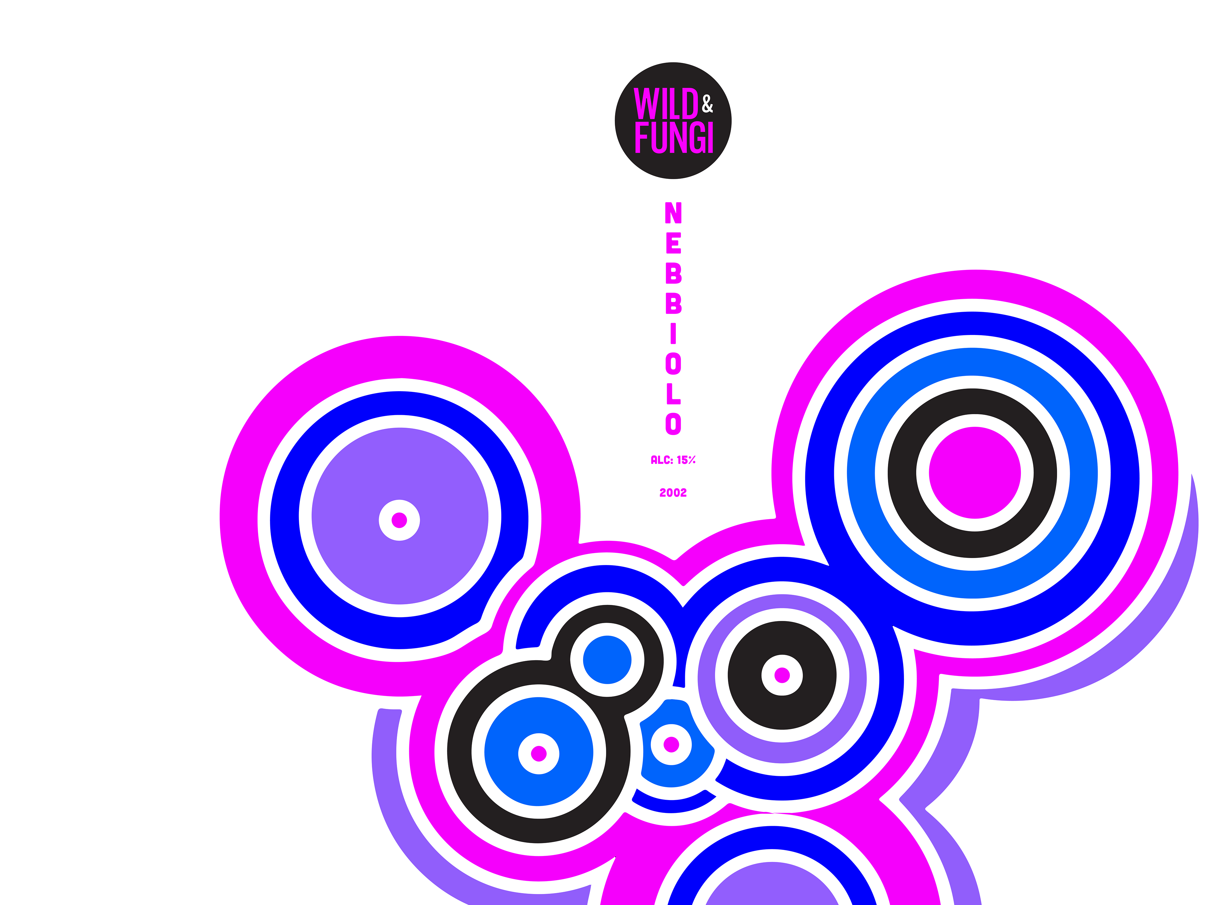
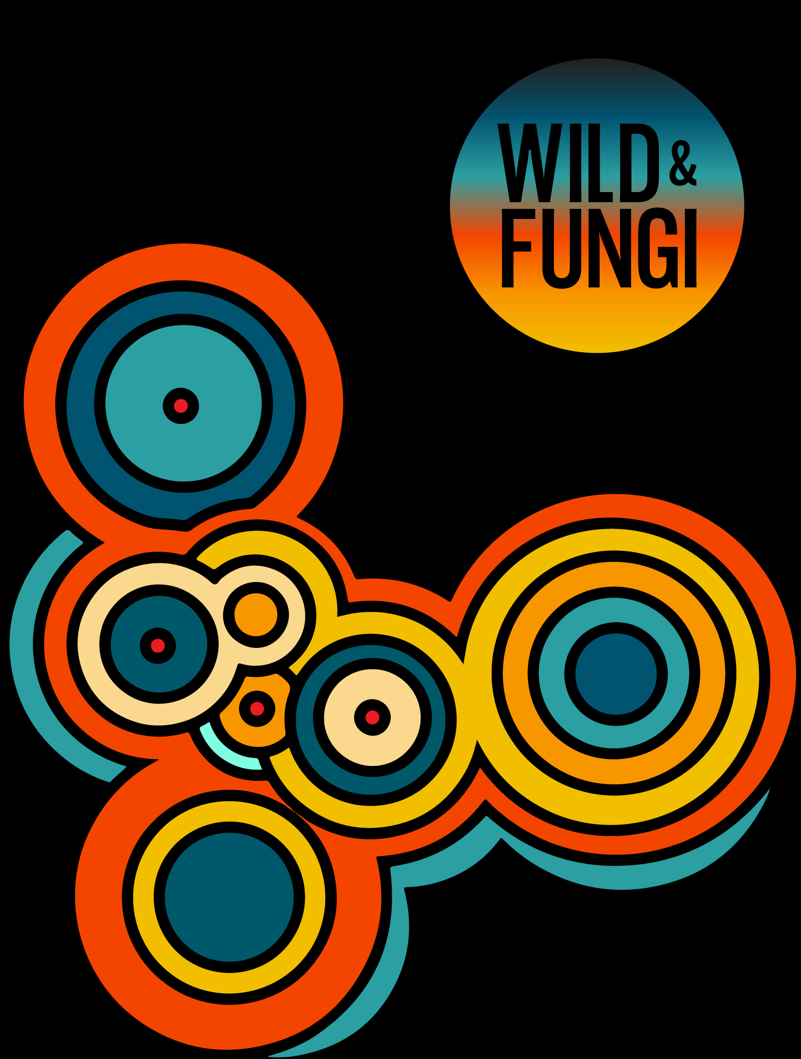
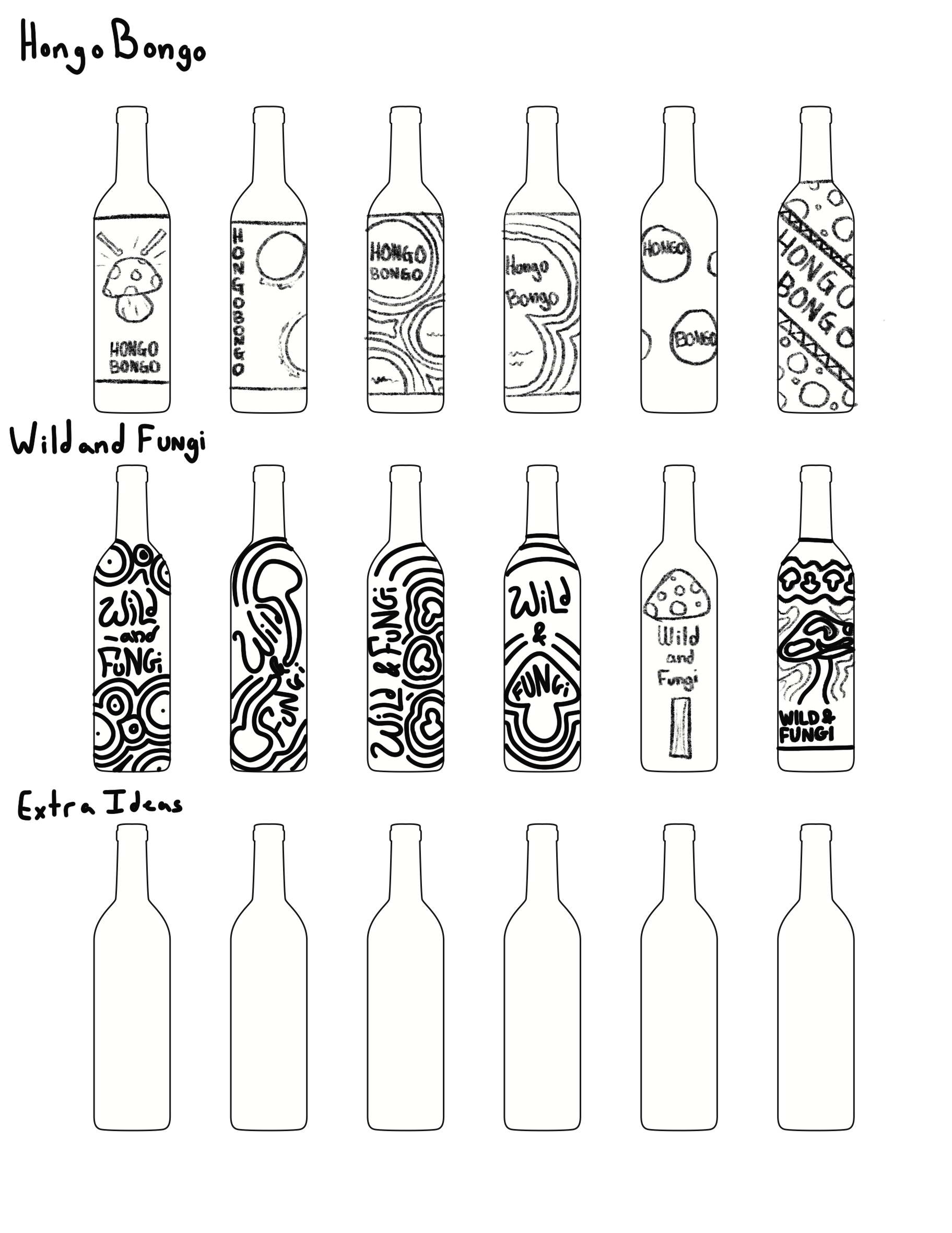
For the Wild & Fungi logo, with the help of my professor I decided to go simple and chic by using a gothic style typeface to give that tall and skinny elegance and having it contained within a circle with the name inside that contrasts against the sphere by color to give it a bold look too. I also wanted a logo that could be interchangeable with different colors and designs and easily apply to different formats or objects.
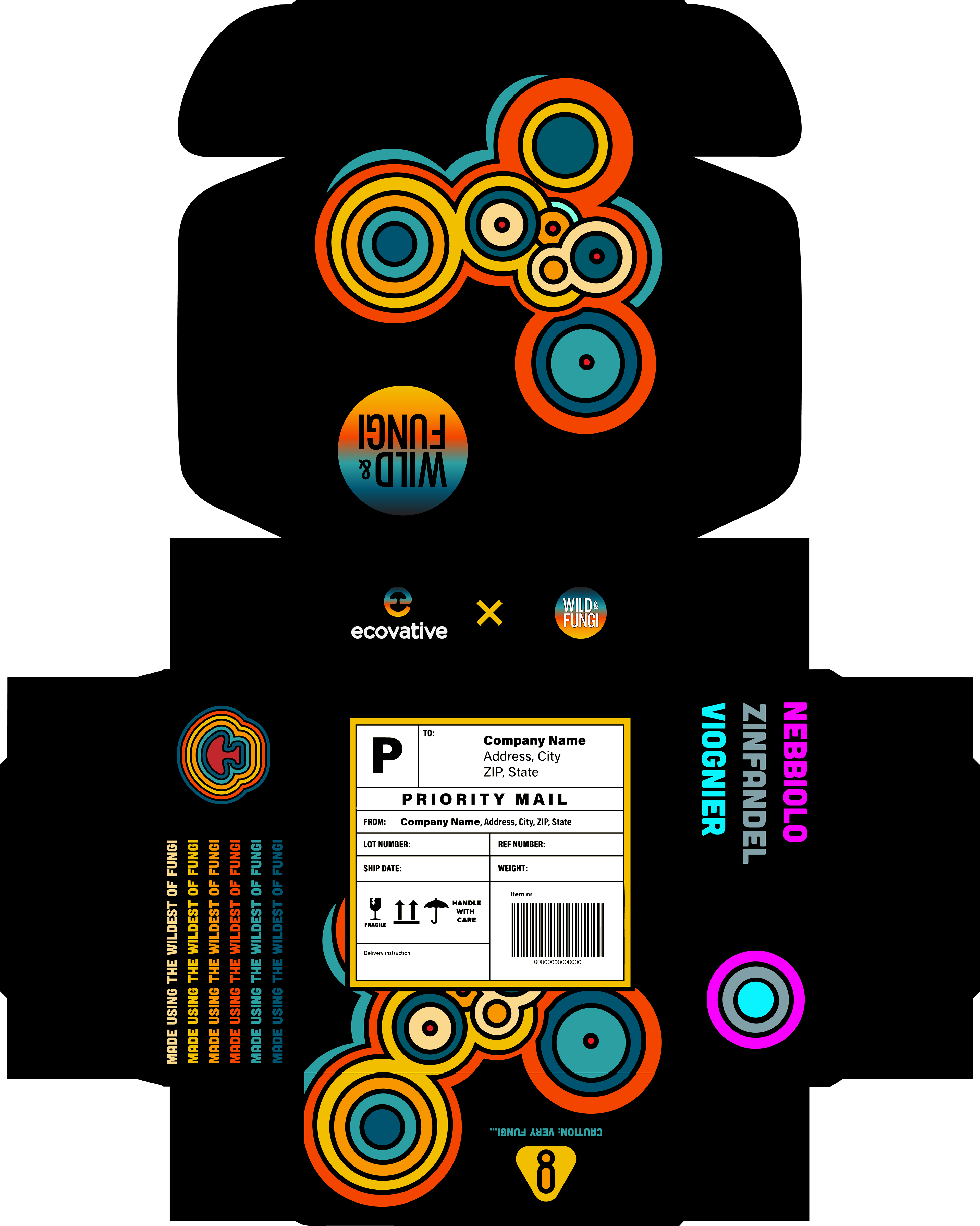
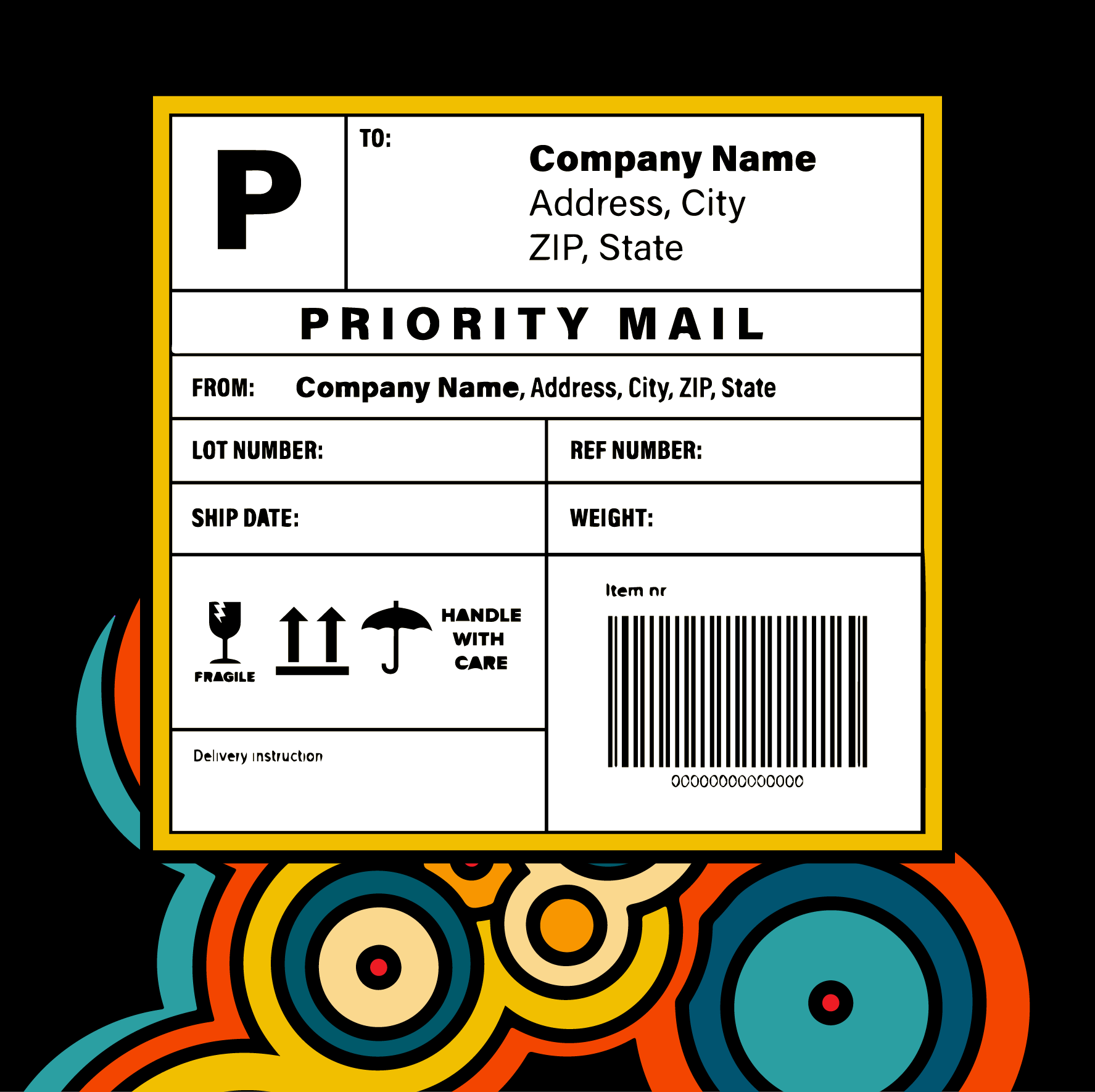
For the mailer box, I wanted to fully emphasize the boldness of the colors and roundness of the design while also keeping it simple and easy on the eye. The color palette that I used was based on retro-style colors compared to the vibrant colors on the bottles. That way the box can be more friendly and softer in appearance so it can be a nice piece to keep around or showcase for those who enjoy keeping the packaging of products.
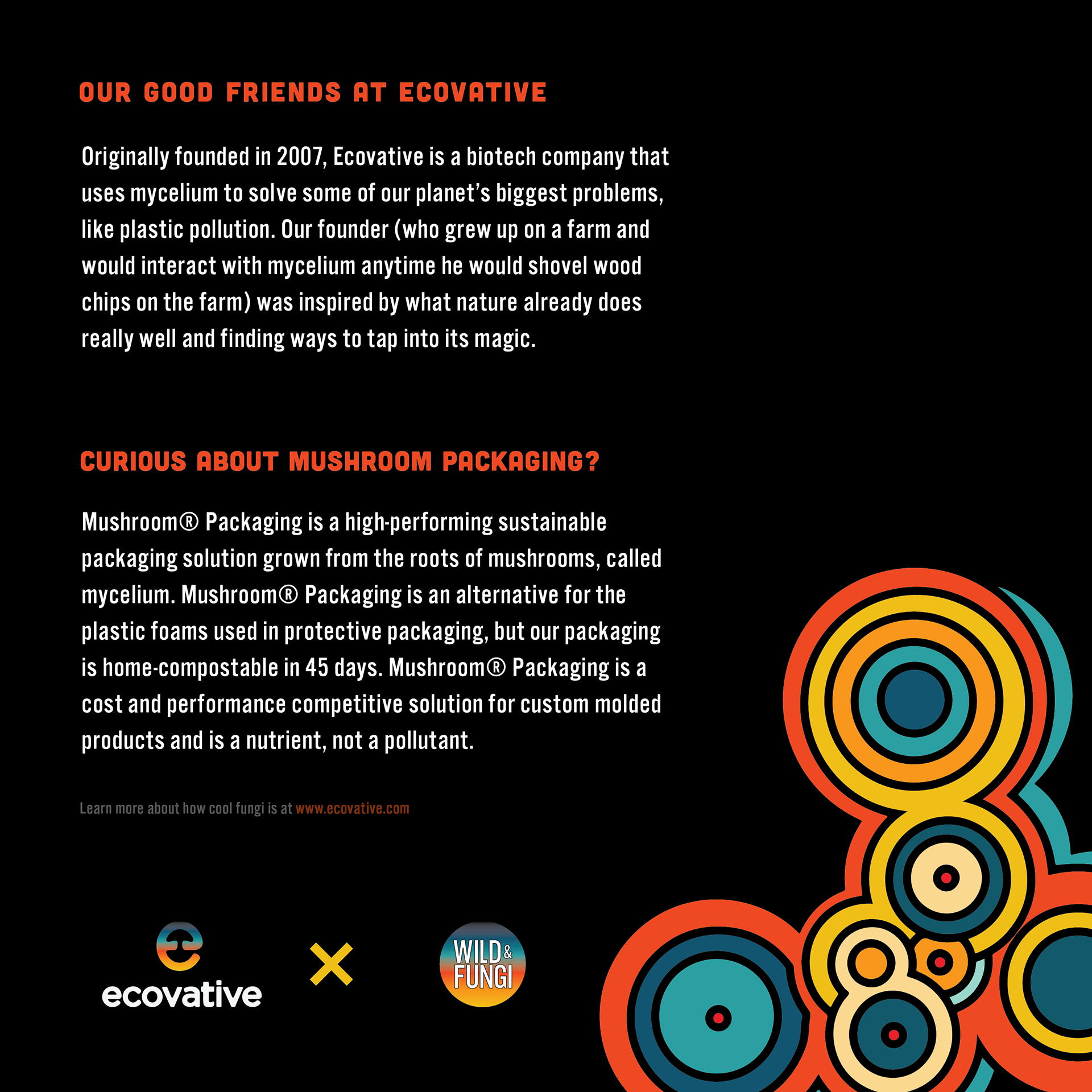
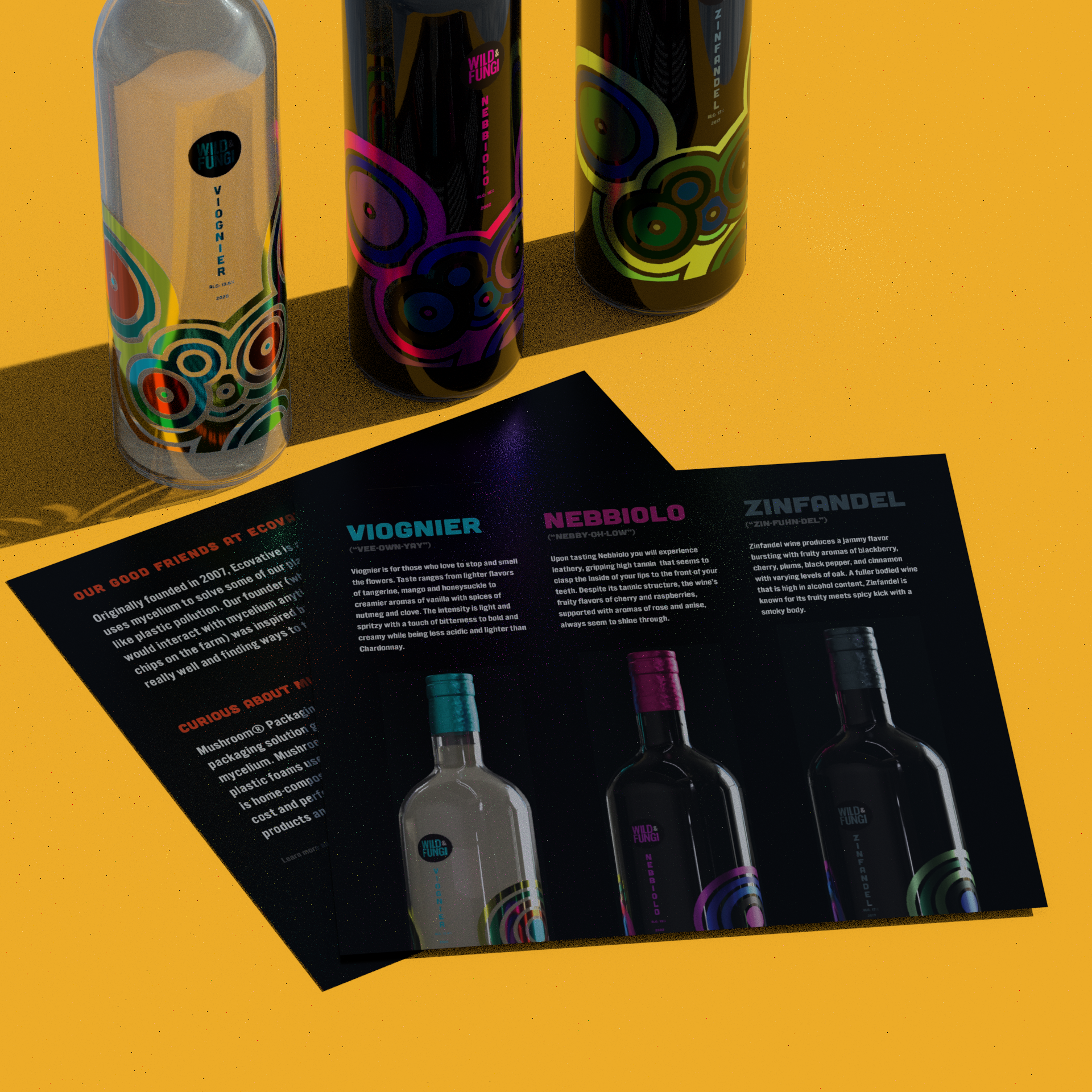
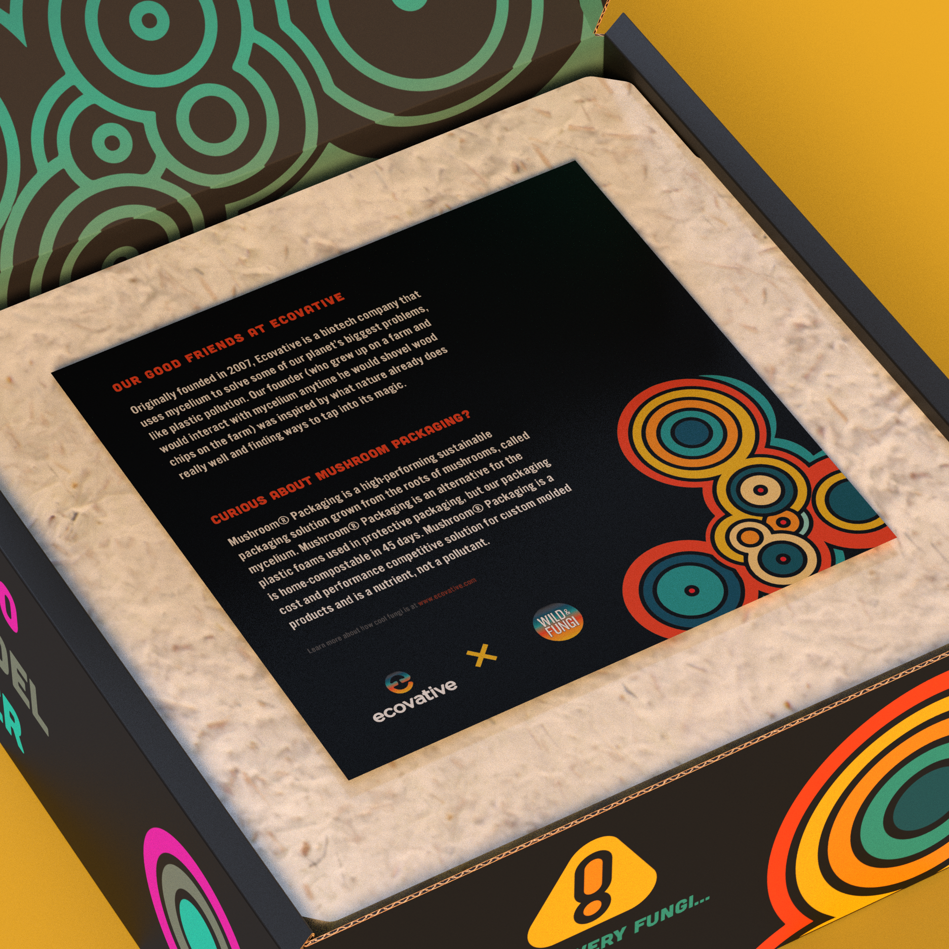
To accompany the mailer box, I also created a little introduction postcard that gives some background on who Ecovative is and all the fascinating things they're currently making with mushroom packaging.
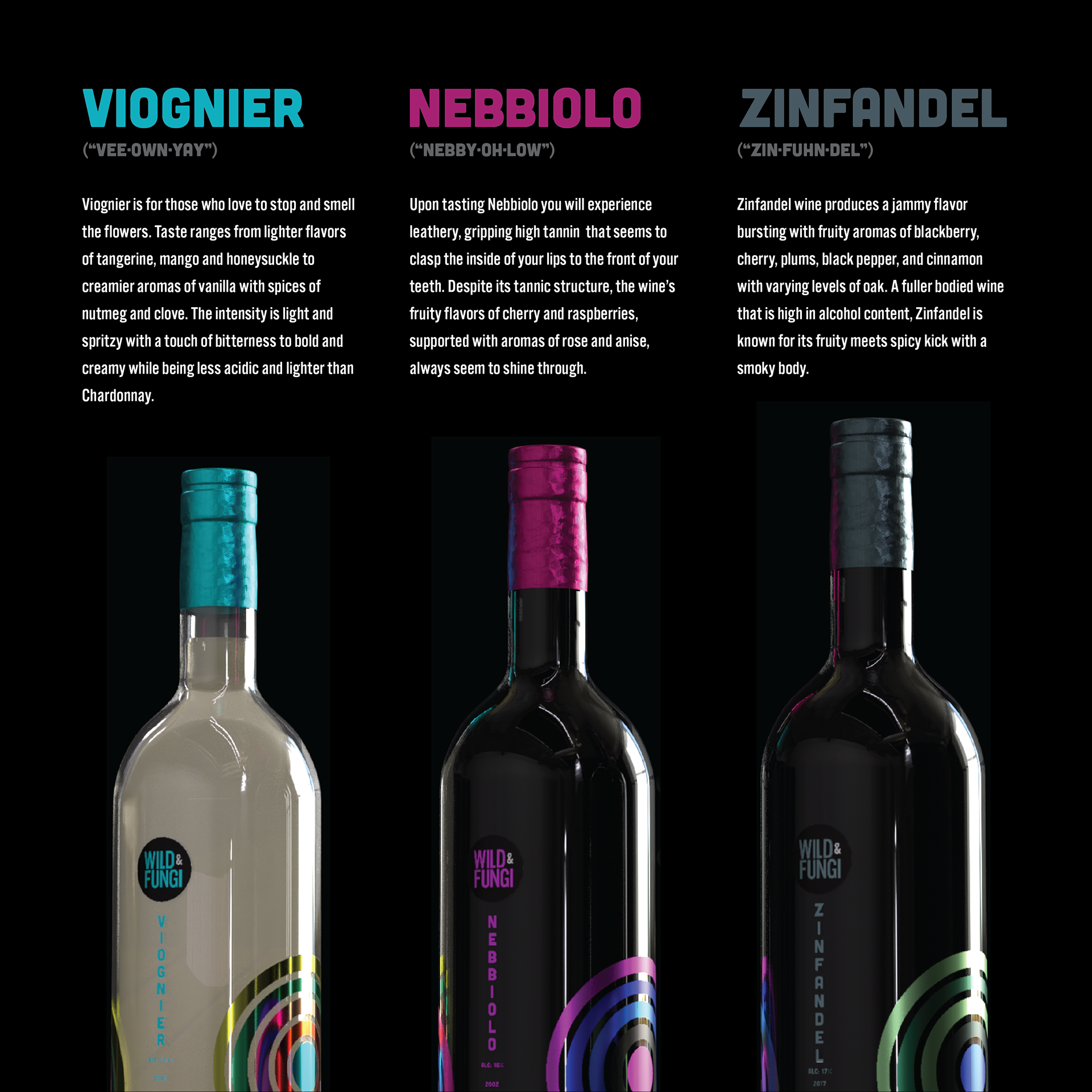
On the back of the card, I put an informative description of the three wine flavors that include the name pronunciation, flavor notes, and texture.
As someone who doesn't drink wine, I thought this would be a helpful thing to include as it tells what each wine would taste like beforehand instead of just guessing.
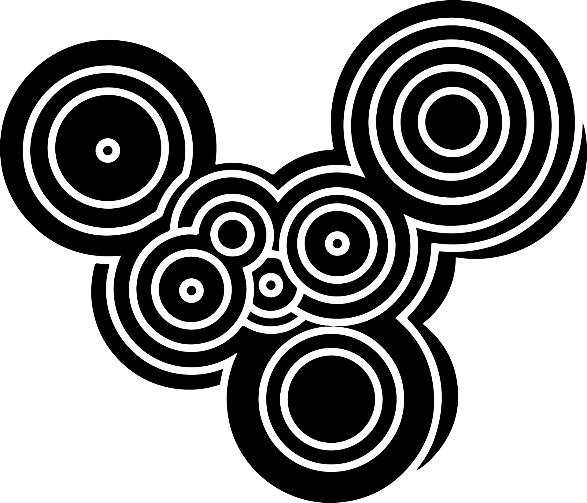
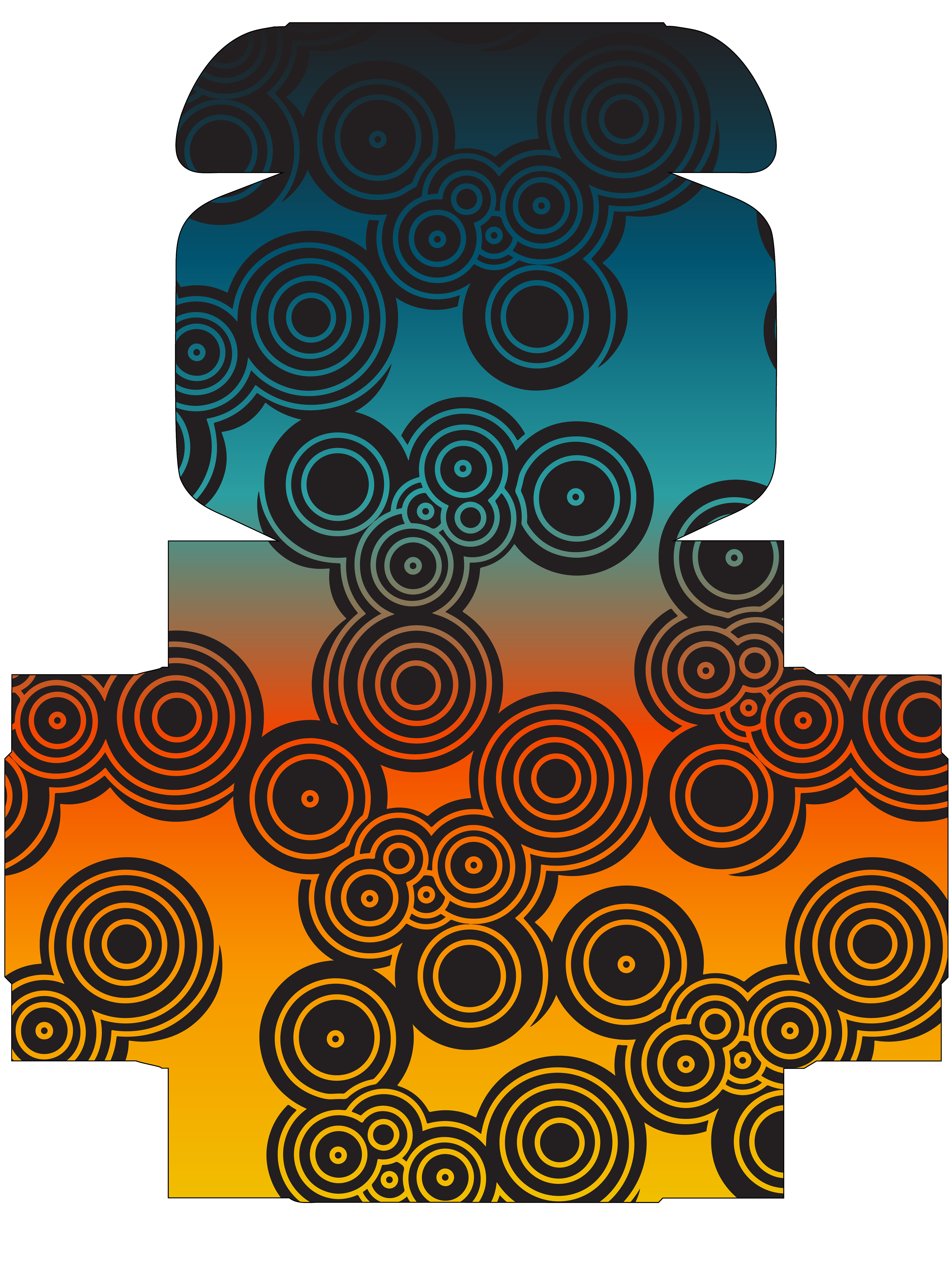
This is the lovely design pattern that I designed for the brand and used everywhere throughout the brand. When I found out that the theme was going to be mushrooms, I instantly thought of the word Round and the idea of lack of hard corners. I was also inspired by the red with white spots mushroom, also known as the Fly Agaric (Amanita muscaria if you want to get scientific) mushroom which is also used in the Super Mario franchise.
The design was present from the start when I was still first deciding what the brand name was going to be and coming up with label ideas. The reason I stuck with this design idea was mostly that when thinking of mushroom characteristics all I could think of were spores. Spores promote growth and new life for mushrooms, but could also be the growth of new creativity in a metaphorical way.
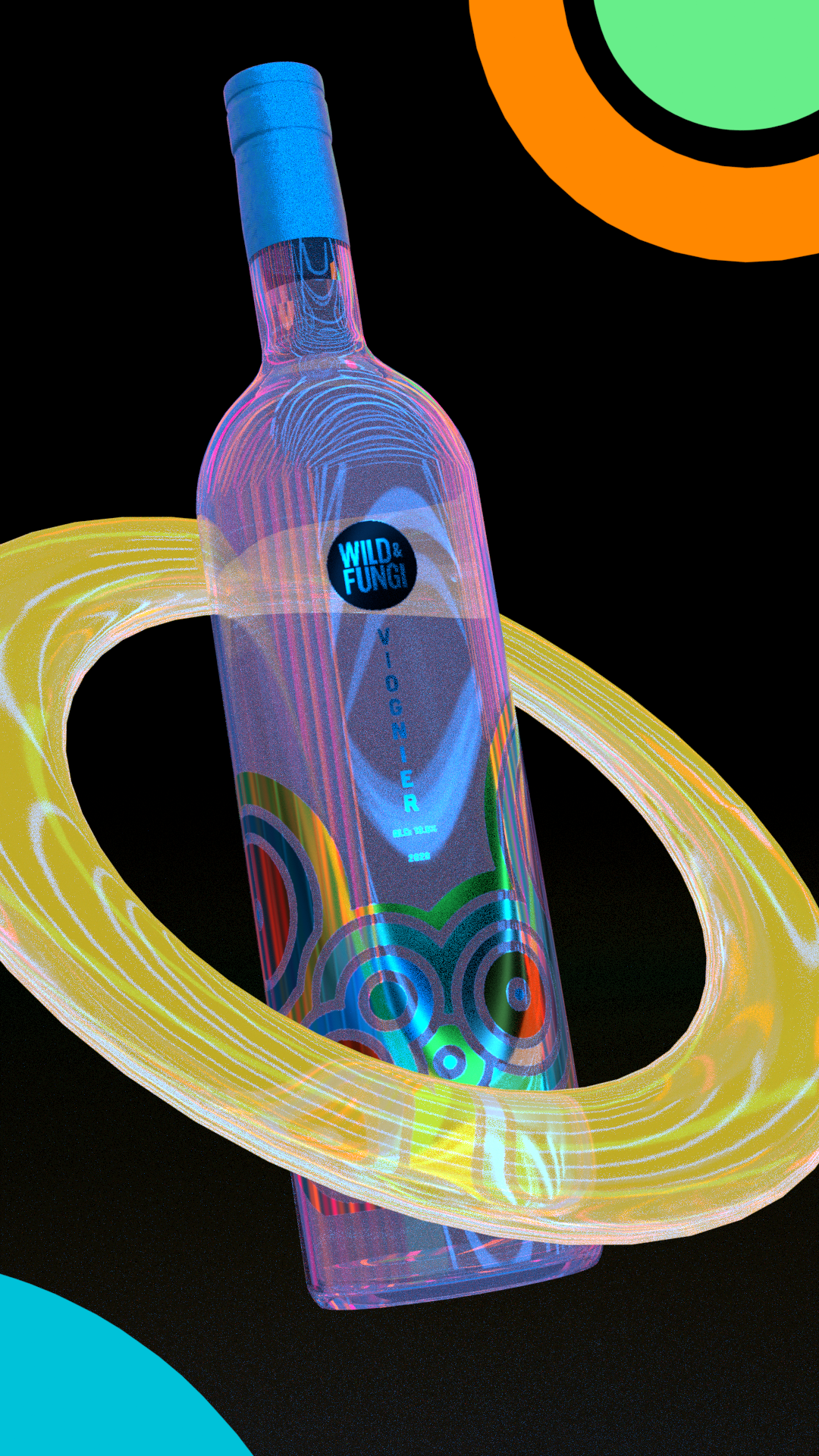
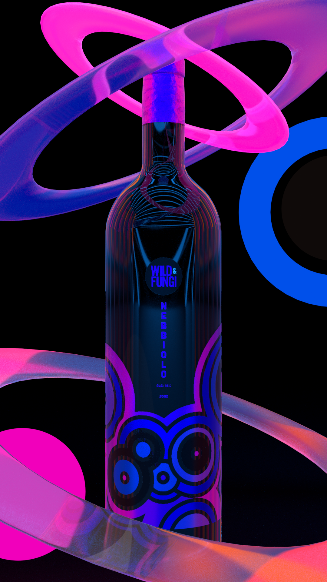
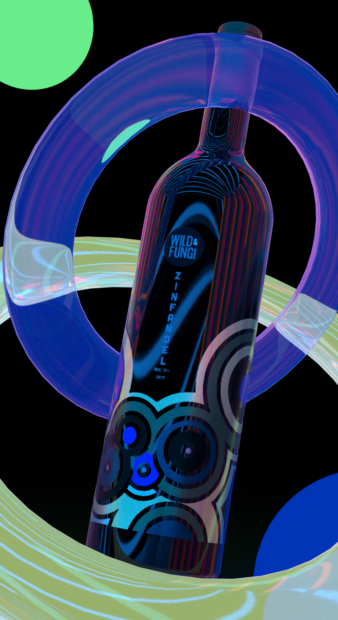
These are some extra renders that I made when I was playing around with the lighting settings in Adobe 3D Stager and stumbled across the arcade lighting setting. It turned out really cool and very colorful which I felt complimented nicely with the design. The lighting also reminded me of bioluminescent mushrooms as well which is a funny coincidence.