
In this project, we created our magazine set concept for The New Yorker which was based on foods from all around the world. The selected locations I chose were Kyoto, Florence, and Singapore and the food theme I went with was Noodles.
Kyoto Magazine Cover
Florence Magazine Cover
Singapore Magazine Cover
When we first originally started we were given the prompt "Design magazine cover series for three food cultures and cuisines. Should be rich in heritage, flavorful, and full of tradition regarding the preparation and gatherings."
Along with the prompt, the given locations that we could choose from were: Oaxaca, Mexico / Hong Kong, China / Lyon, France / Singapore / Florence, Italy / Beirut, Lebanon / Kyoto, Japan.

Florence Idea Sketches
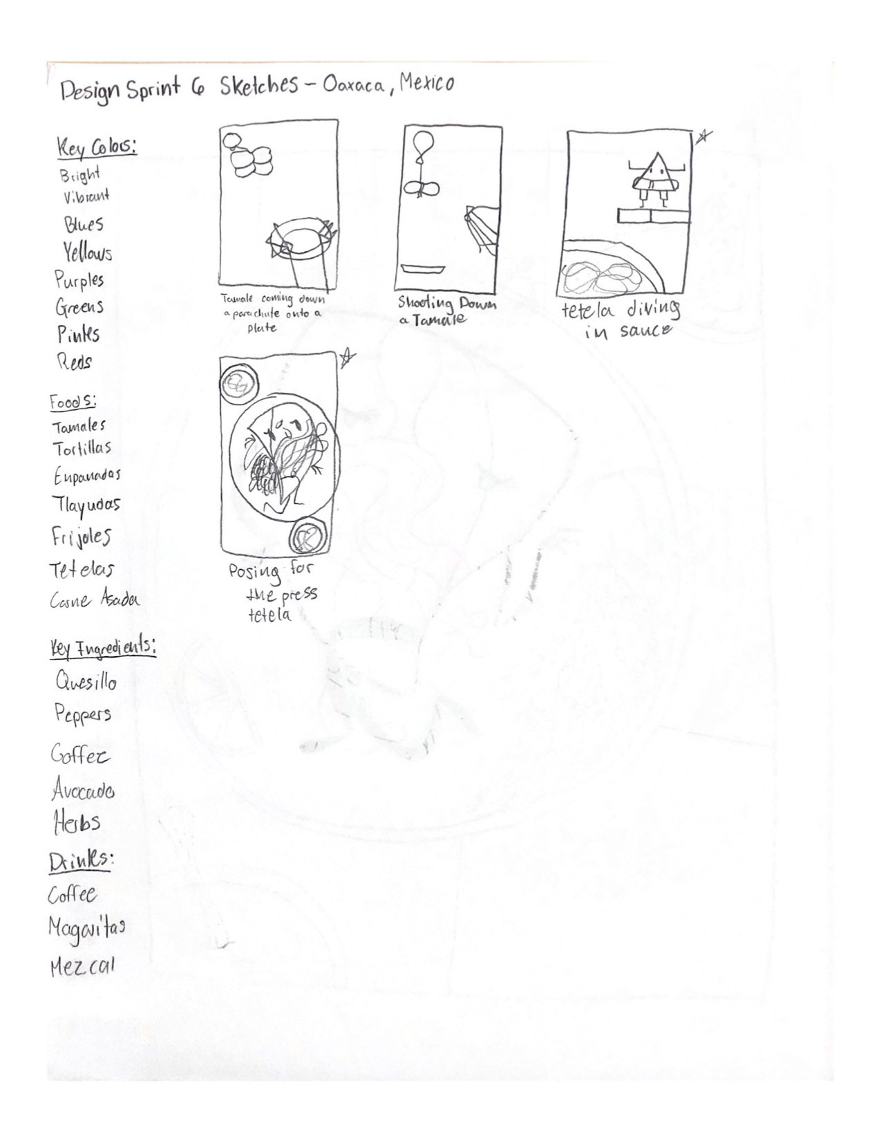
Oaxaca Idea Sketches
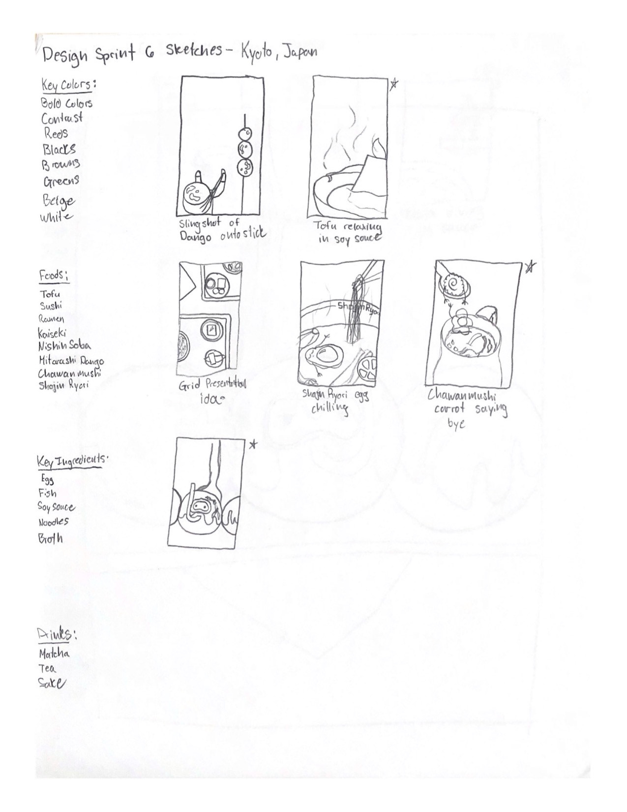
Kyoto Idea Sketches
I originally had chosen Florence, Oaxaca, and Kyoto as my locations to do. When I was creating ideas I first started by making multiple lists to help gather some ideas and background on these places. The lists consist of key colors, food dishes from the location, and key ingredients that are used in the dishes.
After making my lists, I then started to make my thumbnail sketches; the idea I was going for was an illustrative and humorous approach by having some dishes be anthropomorphic and interacting within the dish.
Florence Proposed Idea

Oaxaca Proposed Idea
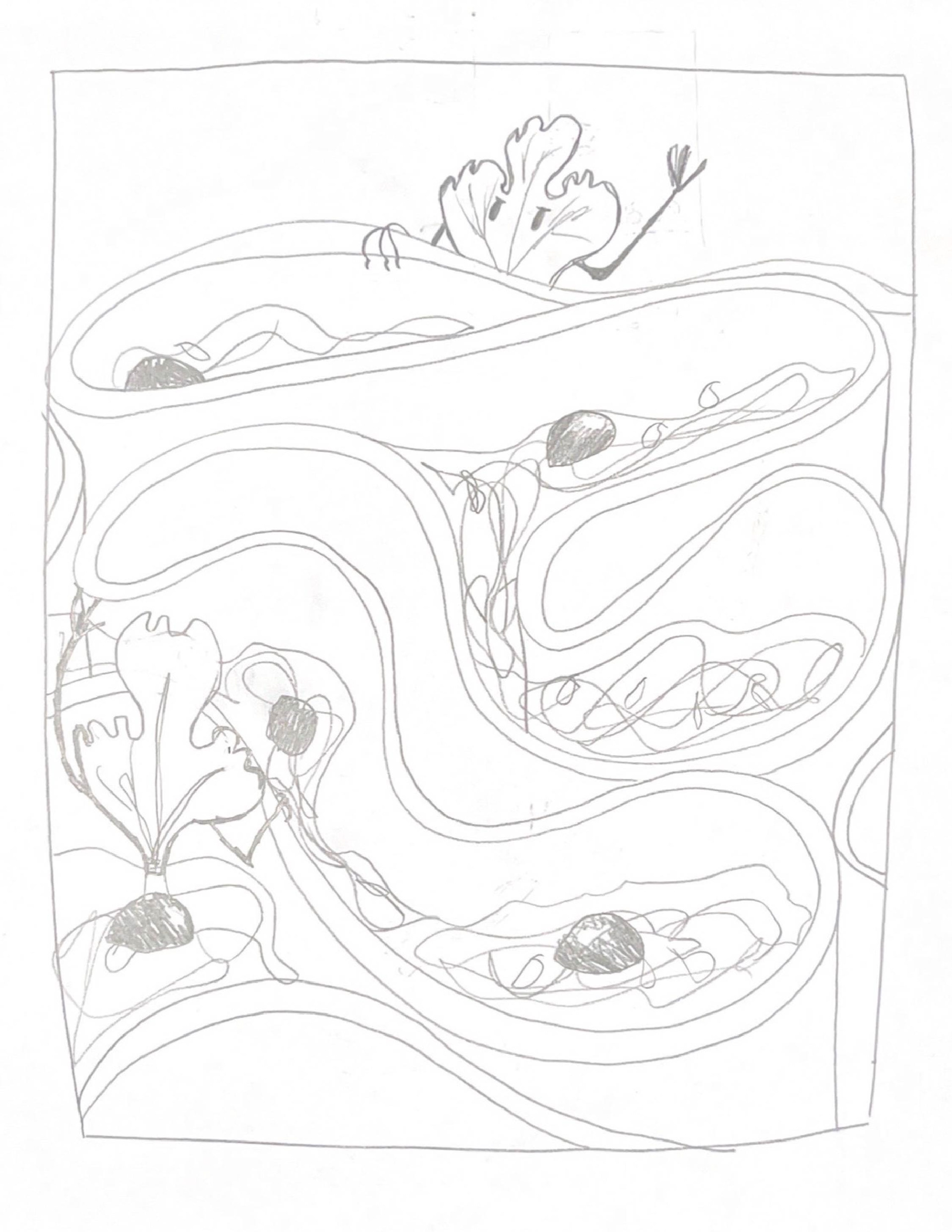
Kyoto Proposed Idea
After finishing my thumbnail sketch ideas, I went for the idea "Lost in the Sauce" Parpadelle al Cinghiole for Florence, "Posing for the Press" Tetela for Oaxaca, and "Glazing" Mitarashi Dango for Kyoto.
After getting some feedback about my ideas, I was mentioned to that The New Yorker is considered a "Serious toned" magazine publisher so having anthropomorphic food wouldn't be a good fit which I was confused about considering some of their previous covers, but I went ahead and redid and thought of a different approach for my covers.
Florence First Finish Cover
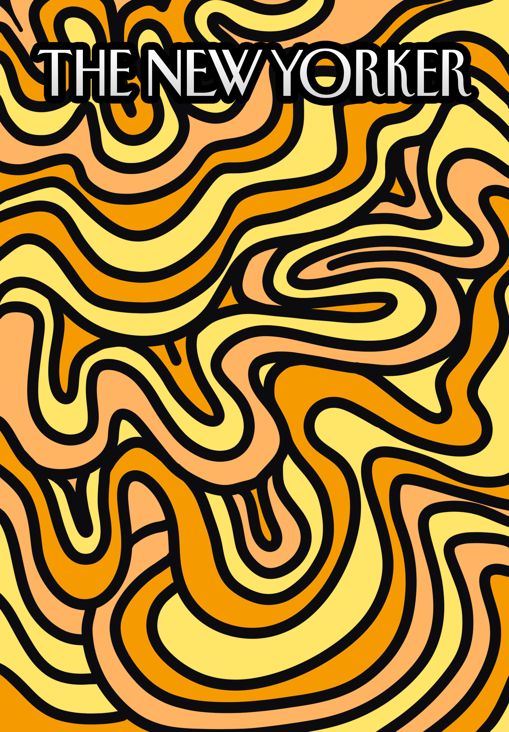
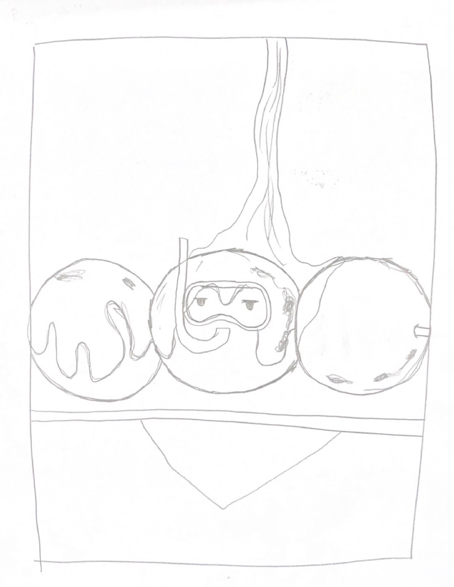
Kyoto First Finish Cover
Singapore First Finish Cover
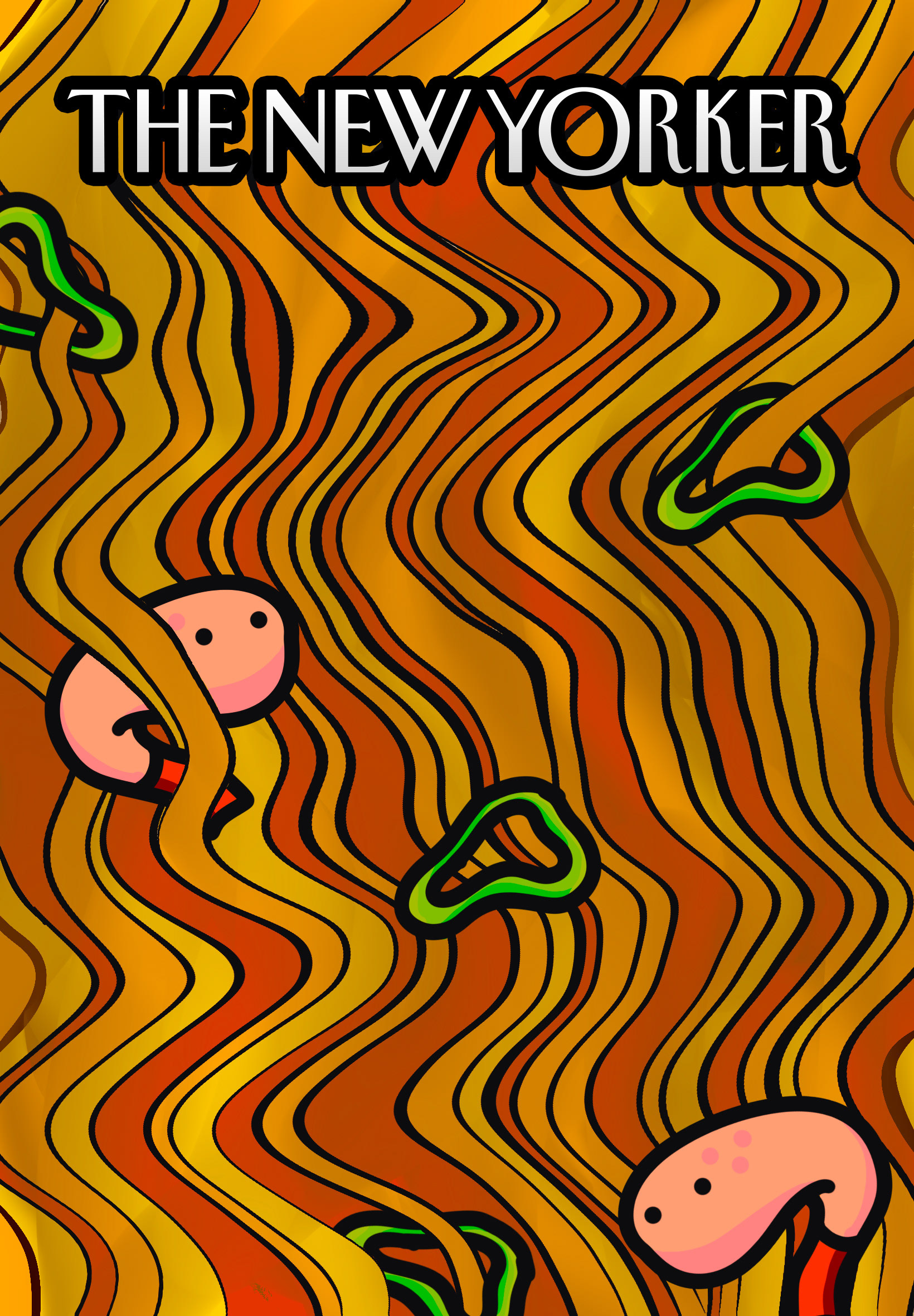
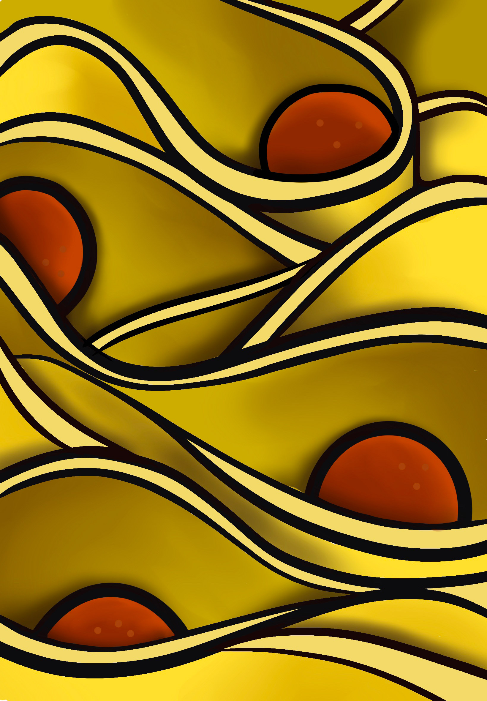
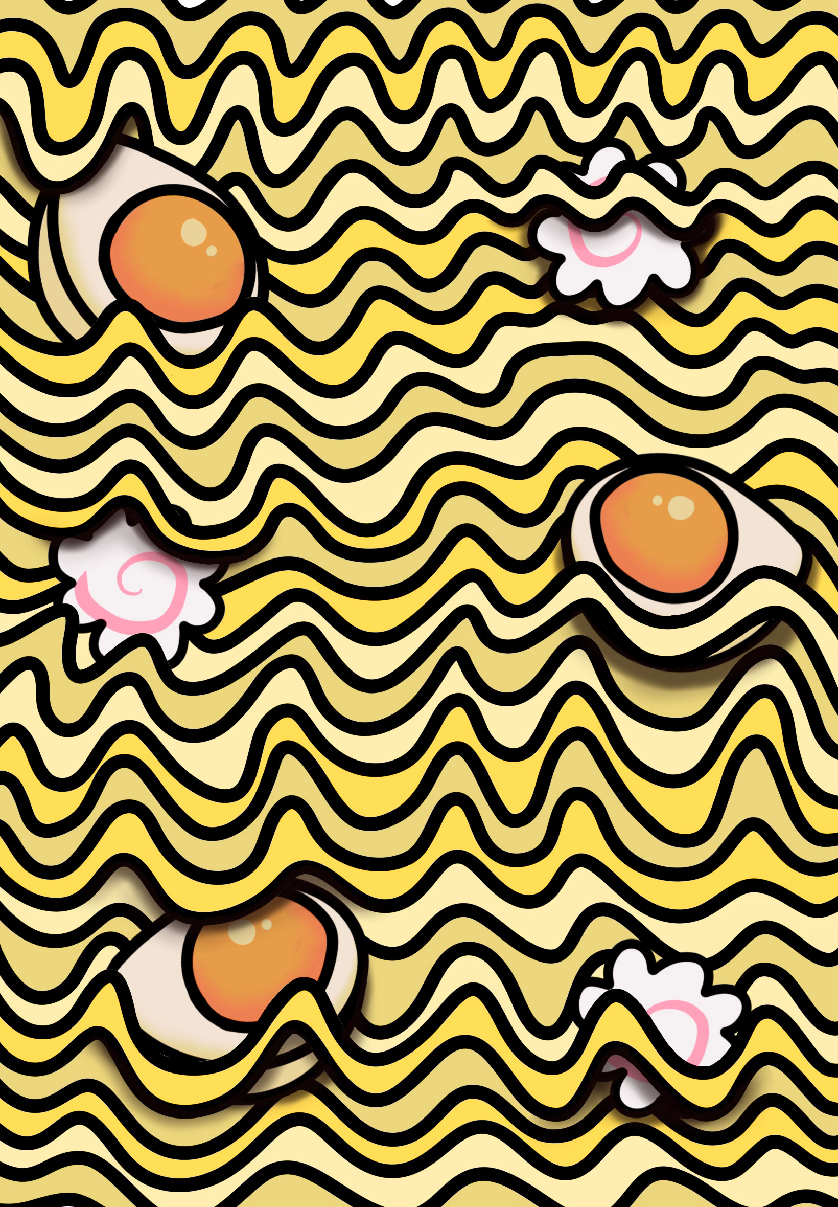
After rethinking and making coming up with a new idea, I opted into making a full-page illustration of noodles from each of the locations as it provided consistency between all of them. I also decide to change the location from Oaxaca to Singapore to make the noodle idea work. These were my first finishes of the covers which I made in Procreate. As you can see there is still some sense of the anthropomorphic idea from my earlier sketches present within the meatballs and shrimps.
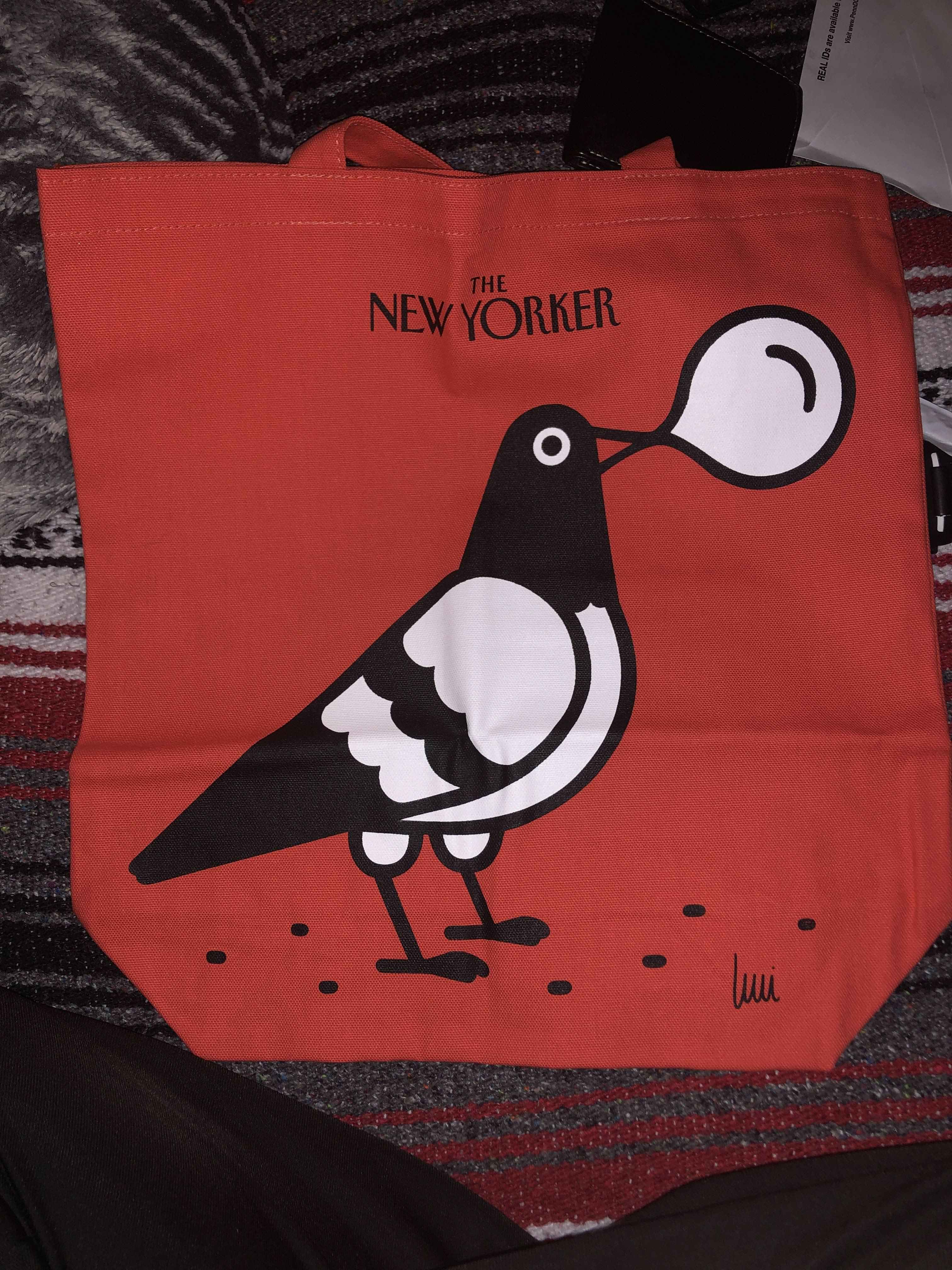
Coincidentally I have a The New Yorker tote bag which I got as a free gift for subscribing to them. I used the design as inspiration since I really liked the rounded edges and bold lines of the illustration.

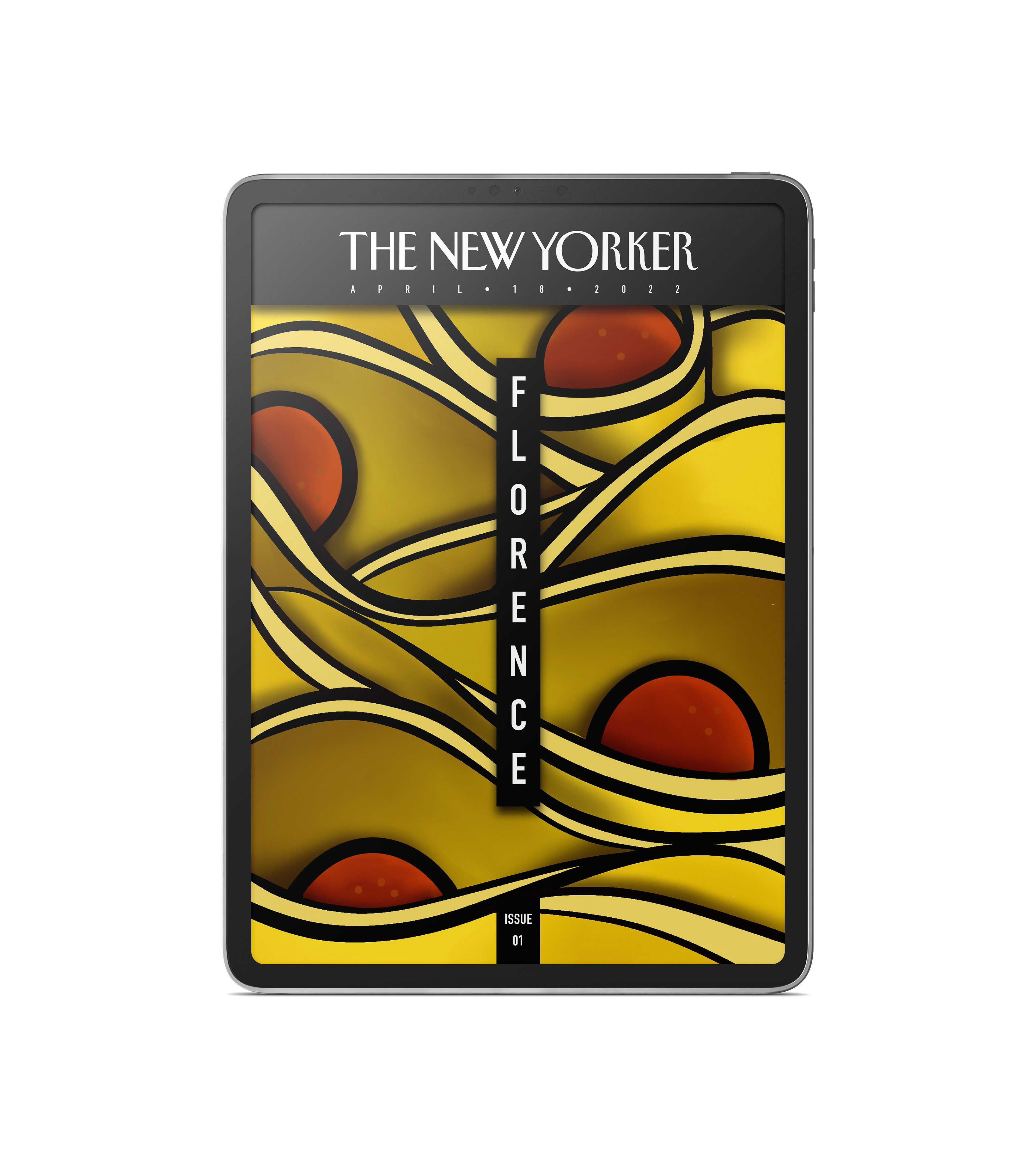
Florence Finished Cover
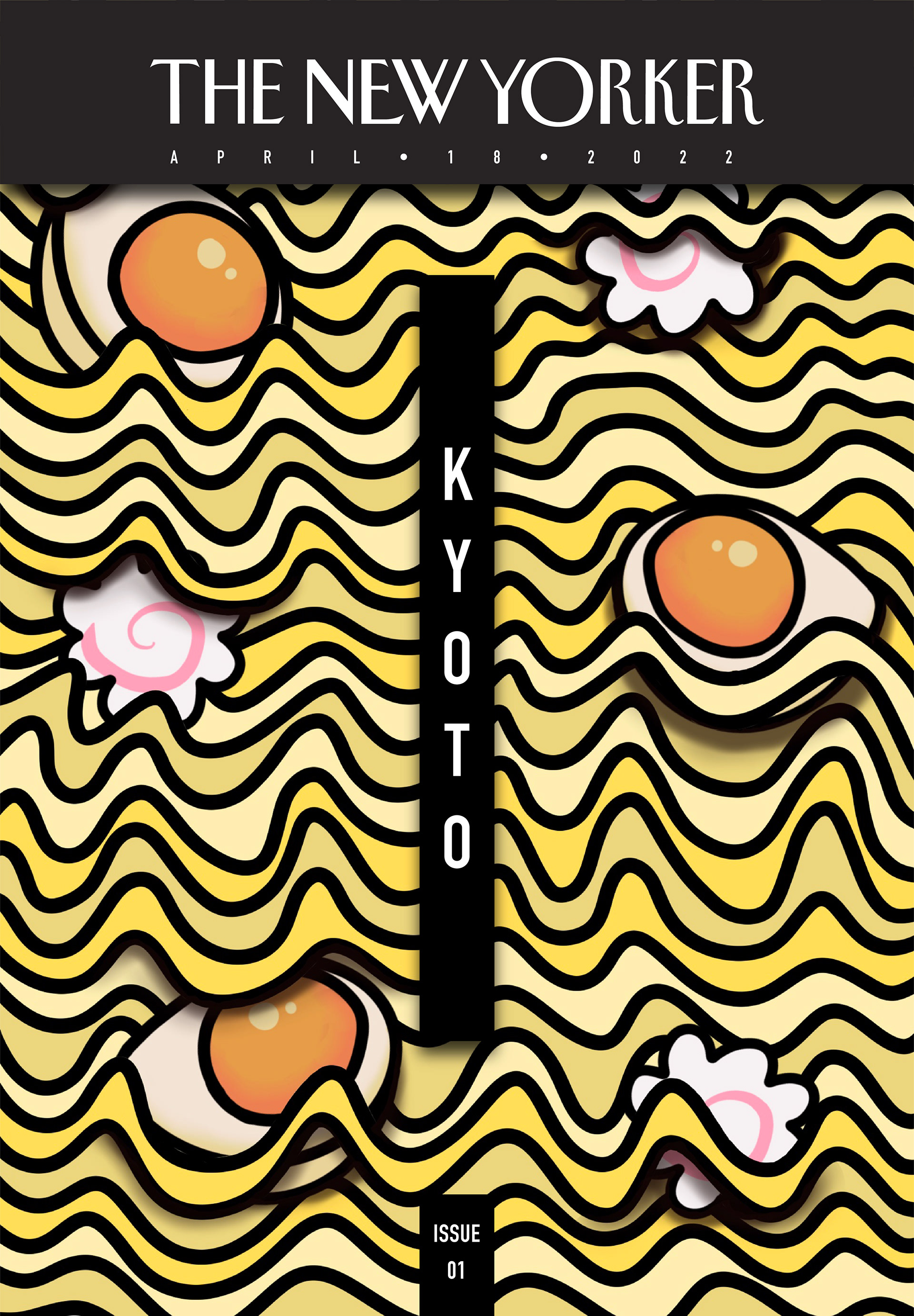
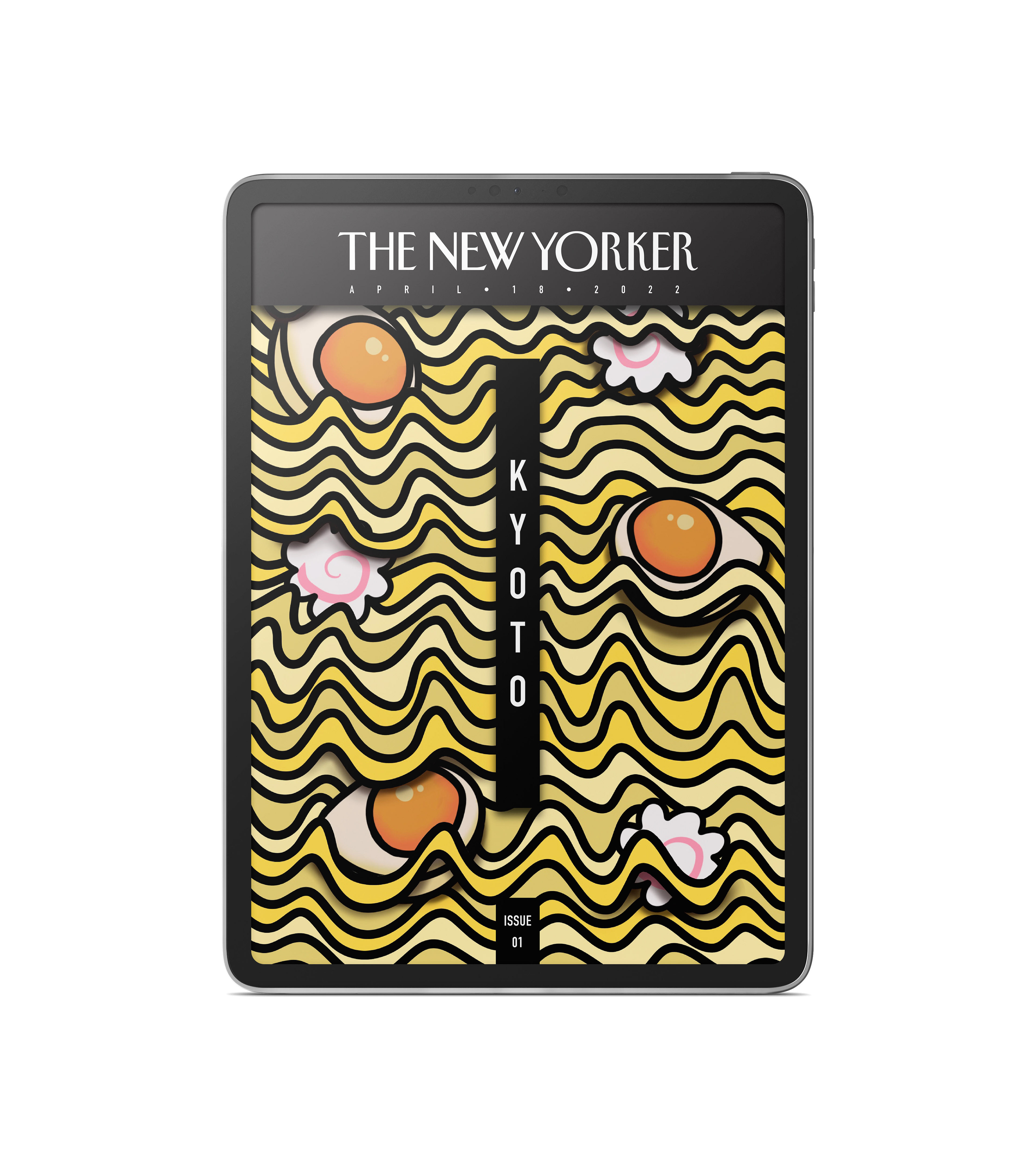
Kyoto Finished Cover
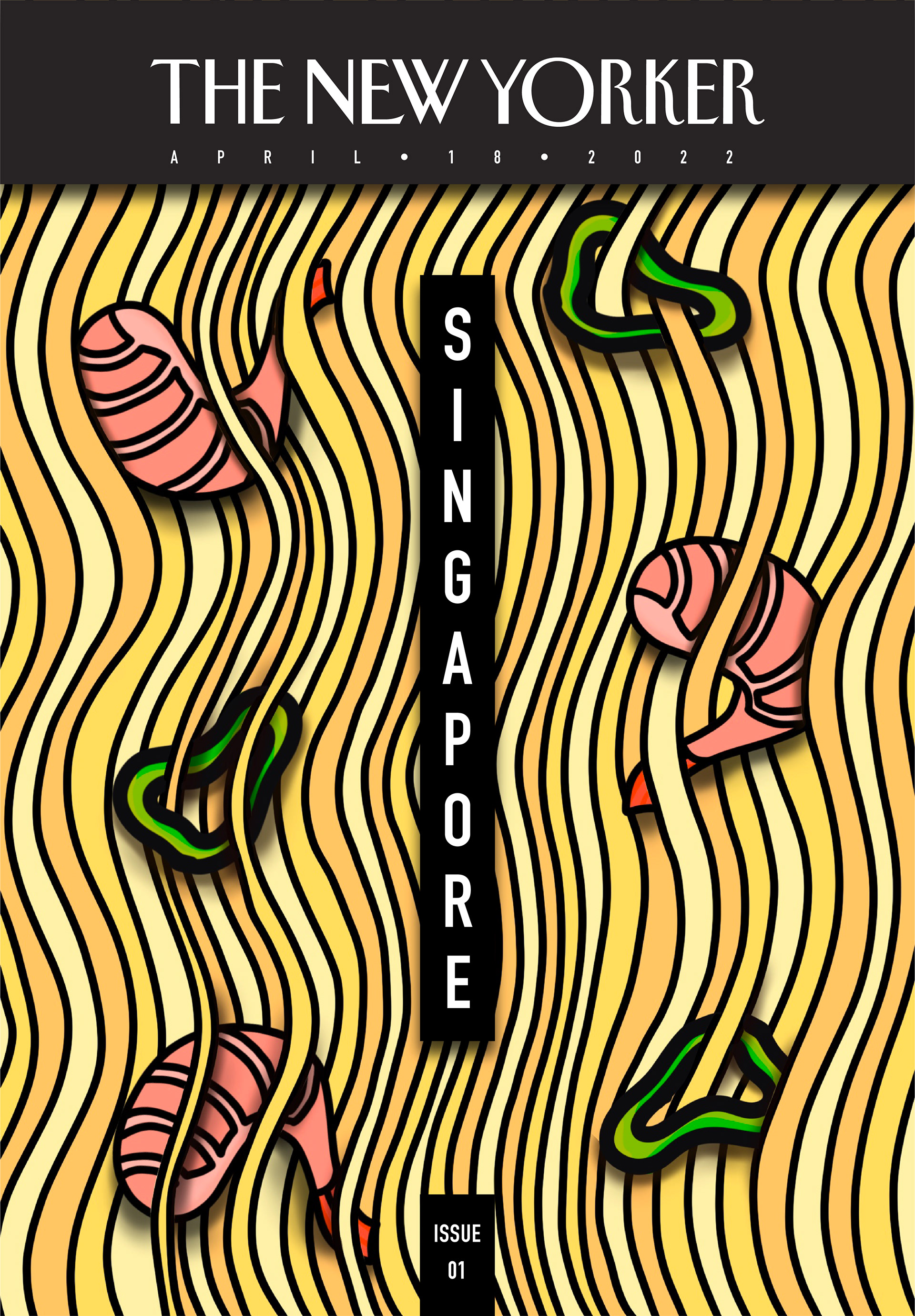
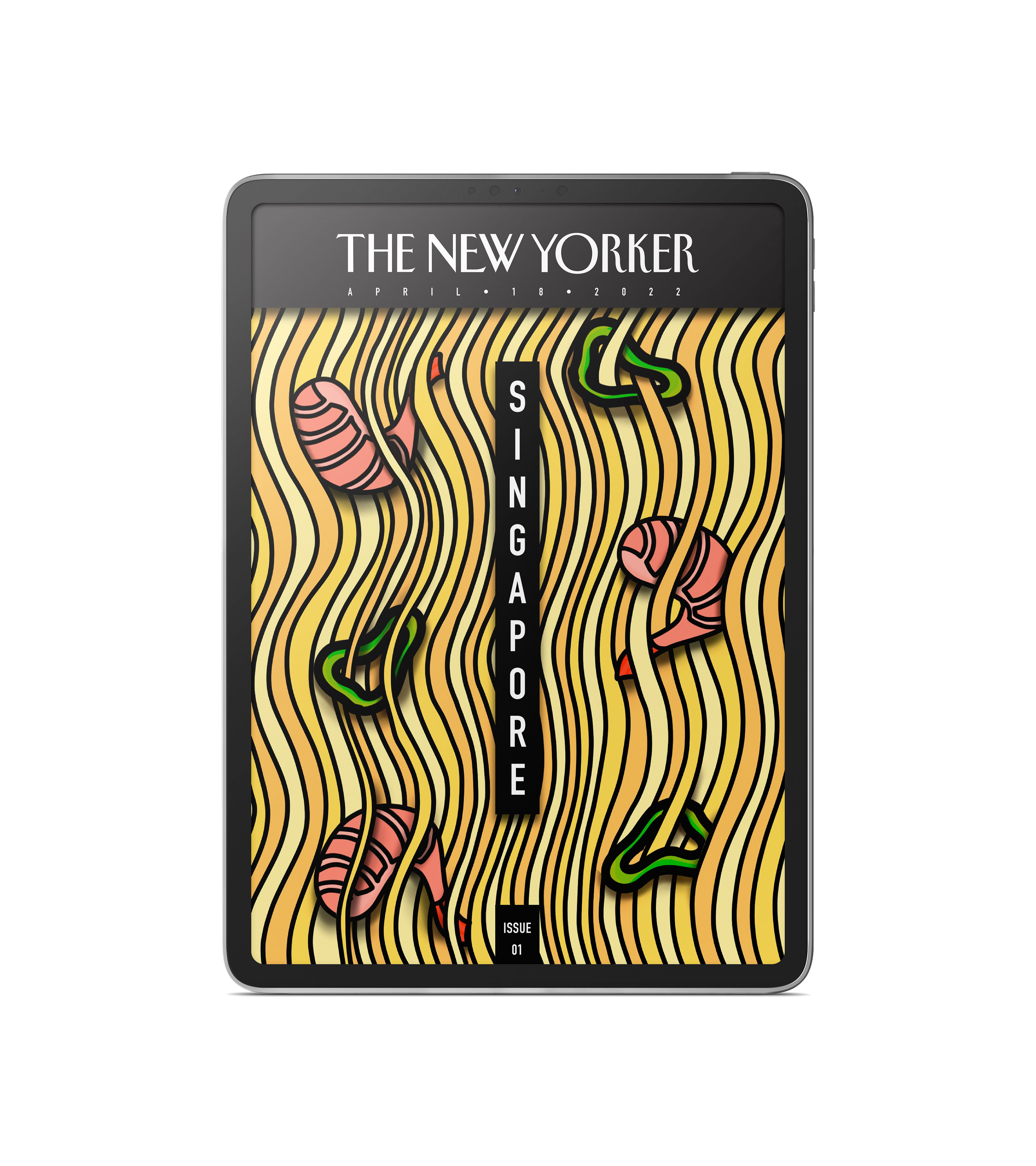
Singapore Finished Cover
These are the final finishes of the magazine covers. I redid the noodles for the Kyoto and Singapore cover to be more realistic in their shape and also removed the entire idea of anthropomorphism from all the covers. I decided to also have the ingredients intertwined with the noodles which is very present in the Kyoto and Singapore cover.
I decided for The New Yorker Logo to be inside of a box towards the top and have the name of each place also contained in a box in the center of the page. I think that it gives a sense of elegance and modernity while also not intruding on the illustrations behind it and creating a grid system. I felt that the boxes were needed because without them the text would get lost or would be clashing with the illustrations.
Florence Full Illustration
Kyoto Full Illustration
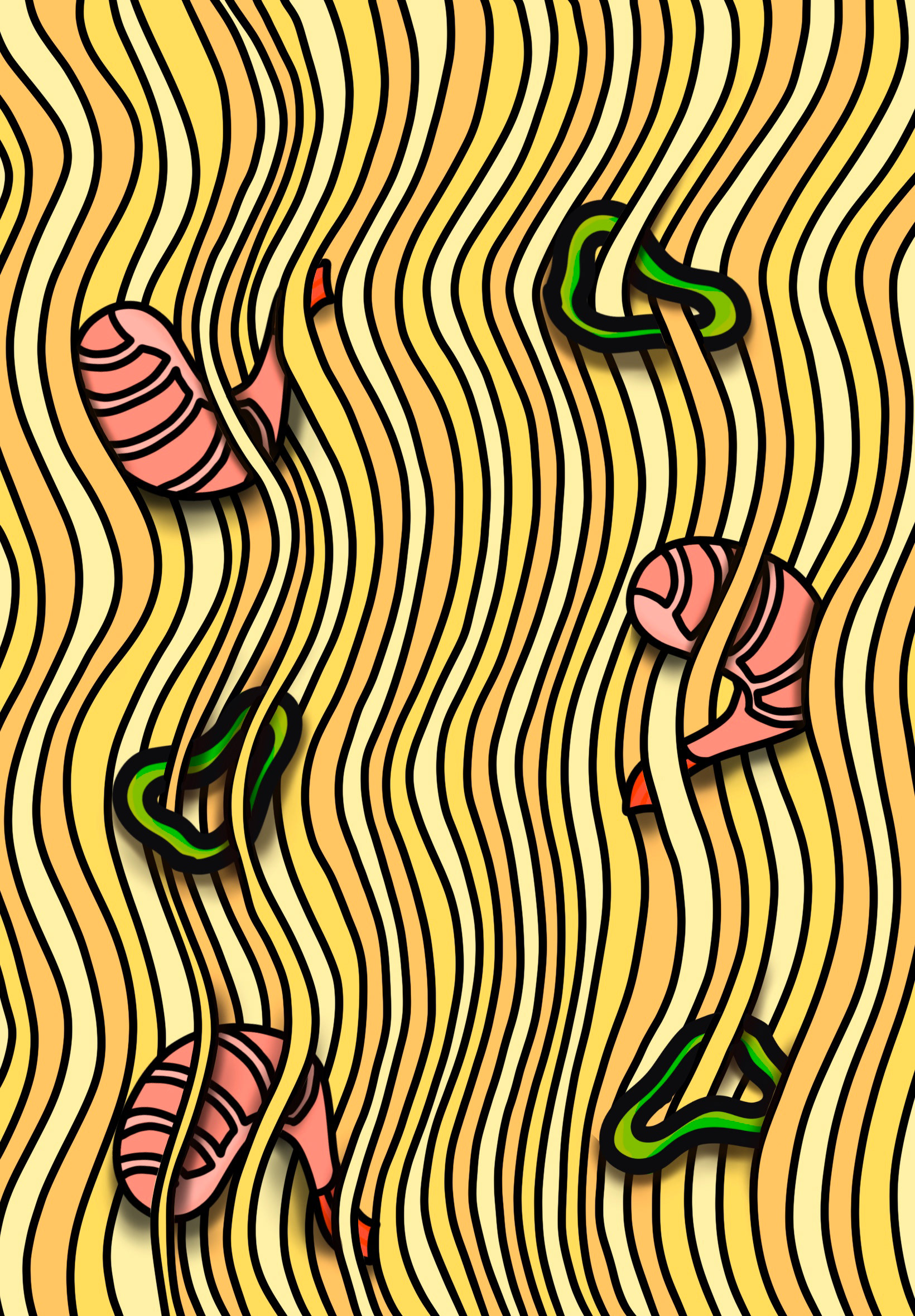
Singapore Full Illustration
Here are the full-sized illustrations without the magazine information. I personally feel like the boxes complement the covers nicely and weren't originally intended but turned out working out for the better.