
The idea for the project, we watched two movies from the list given, and from those two movies, we chose the one we liked the most. With the selected movie we then create possible ideas on how to convert the movie’s story into an image that portrays what the film talks about, as a book cover.
The movie that I decided to design was the movie "Don't Look Up" as it was the one I felt more comfortable making a cover for due to its comedic and unserious tone that accurately describes some events that happen in the real world alongside with a doomsday countdown plot attached to it.
For my initial ideas for the cover, I wanted to make sure it portrayed the feeling of pressure, censorship, politics, and humor as those are some themes that the movie shows.
My first idea is named "Time's Running Out," I sketched out an observatory telescope looking out, but the sky was being censored or restricted access to view to fit the title of not looking up. I also made the title in the digital clock-type font to portray the idea of a countdown to the inevitable doom heading toward Earth. My aim for this idea was to create an artistic cover that is being covered by technological interference to prevent it from being fully shown.
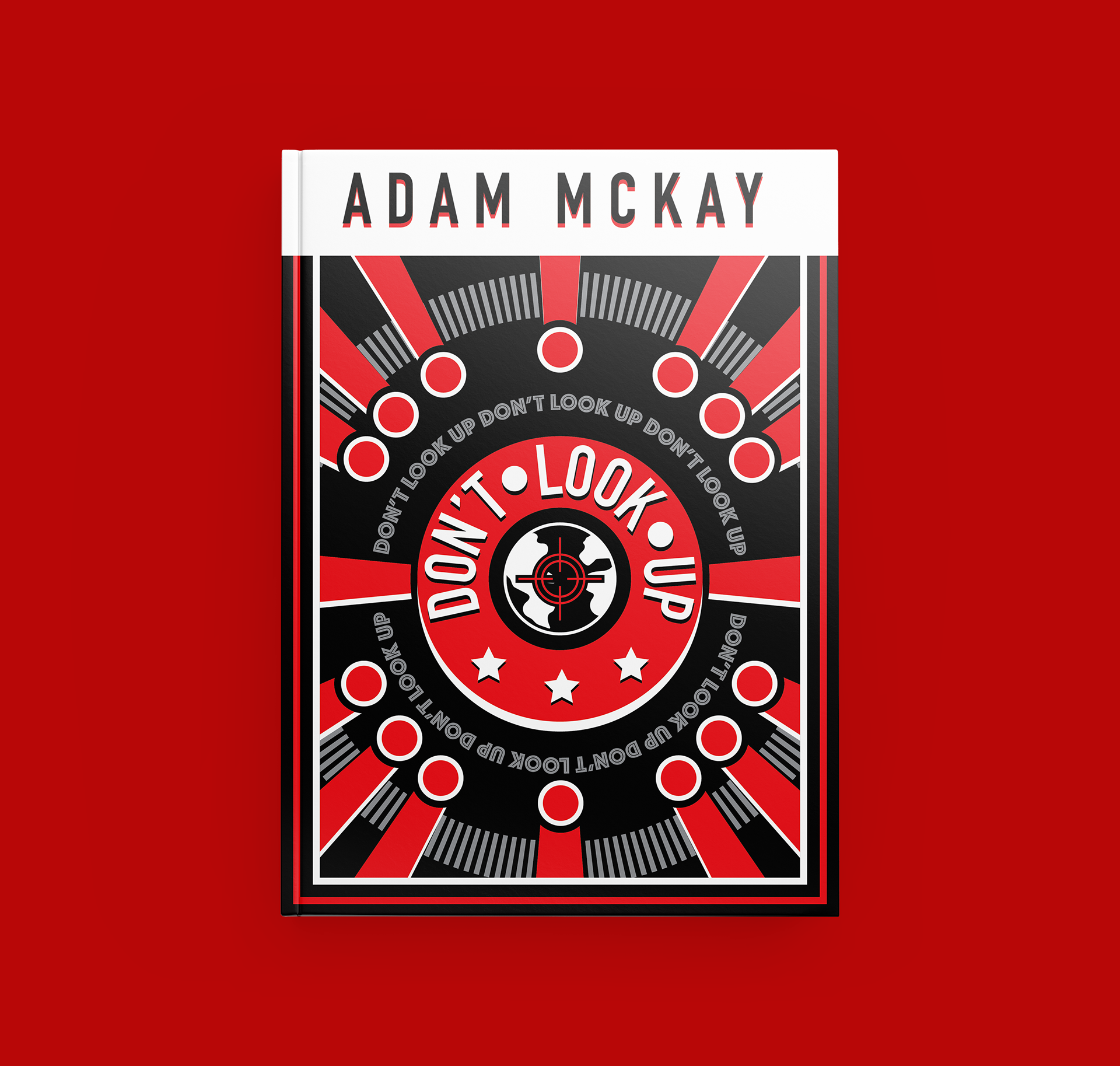
My second idea is named "Asteroids Too Political?" I sketched out to my best abilities what is essentially an emblem/badge that someone in a governmental position might wear. It has the title of the movie circling what is a view of the earth in a crosshair/reticle to show that the earth is currently a target. Towards the top is a series of asteroids that are aiming toward the earth while towards the bottom there is a skyline of buildings. My aim for this idea was to imitate political propaganda posters.

I went with the second idea as I really enjoyed the idea of propaganda being a book cover because in the movie they turned the asteroid into a political issue and made it into a fake story used to promote an agenda so I thought it was fitting.

This was my first finish done digitally in Illustrator, I struggled to transfer it into a digital format because I didn't keep in mind the line weight that I would use since in my sketch it's all one line weight. I also didn't have color in mind, so it currently looks poorly thought out and lacks cohesion.
Some feedback from my professor was to simplify the color palette and keep the line weight consistent with each other and look more into propaganda posters to get more inspiration. After working on it and correcting what needed to be reworked, I got my current cover.
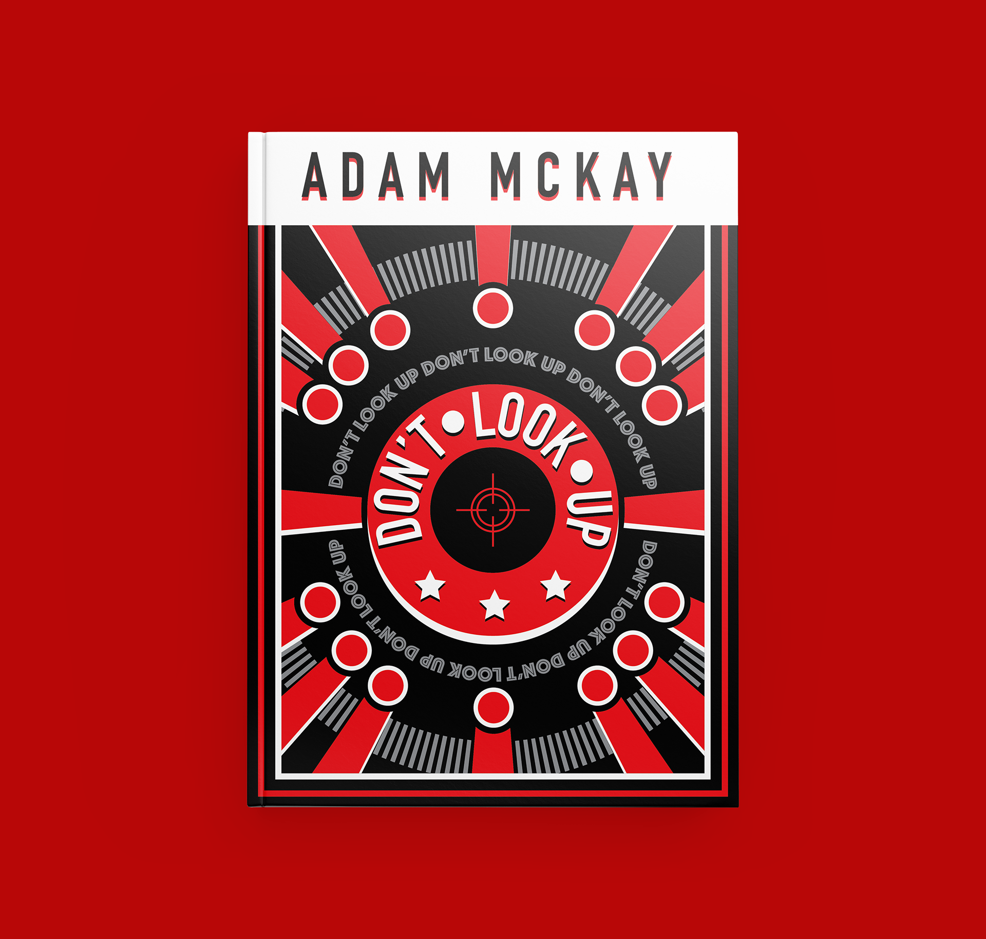

I made two versions of my final cover where one showing the earth not included in the center and one where it is included in the center. I had some prefer the one cover without earth included, but I thought with the planet in the middle it worked better as it gives off that "Oh no, is the earth in danger?!?!"