
In this year’s restaurant project for the Junior Advanced Graphic and Interactive Design program at Tyler School of Art & Architecture, we were tasked to create and develop a restaurant or food business from the ground up where we had to create an idea, purpose, and identity for that restaurant. An example I think I remembered hearing was that “it could be a restaurant built on Mars!” So based on that example, it seemed to be a very open-ended project this year.

The Idea
Out of all my proposed ideas for this project, my strongest idea was CHILL, a stress-free ice cream lounge. The concept of CHILL is a hangout spot for friends or individuals, and also a spot to go and do your work or study while enjoying some cold snax like ice cream. The challenge was “How do I portray and design such an establishment while having fun with it and making it unique?” The process took a lot of effort, as I took this as an opportunity to also attempt and go out of my comfort zone to try out new ideas and designs that I’ve never tried before.
Mission Statement
CHILL is an Ice Cream Lounge that provides a hangout spot for people to come and chill in a stress-free and relaxing environment while being able to enjoy frozen treats. Come in and make yourself comfortable while bringing some friends or even yourself to just hang out, take a break, have a spot to get some work done, or get a treat to go! Chillax with Cold Snax at CHILL!
Logo
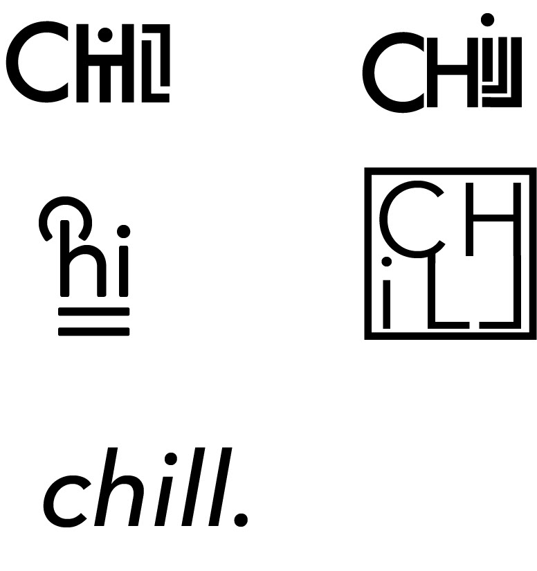
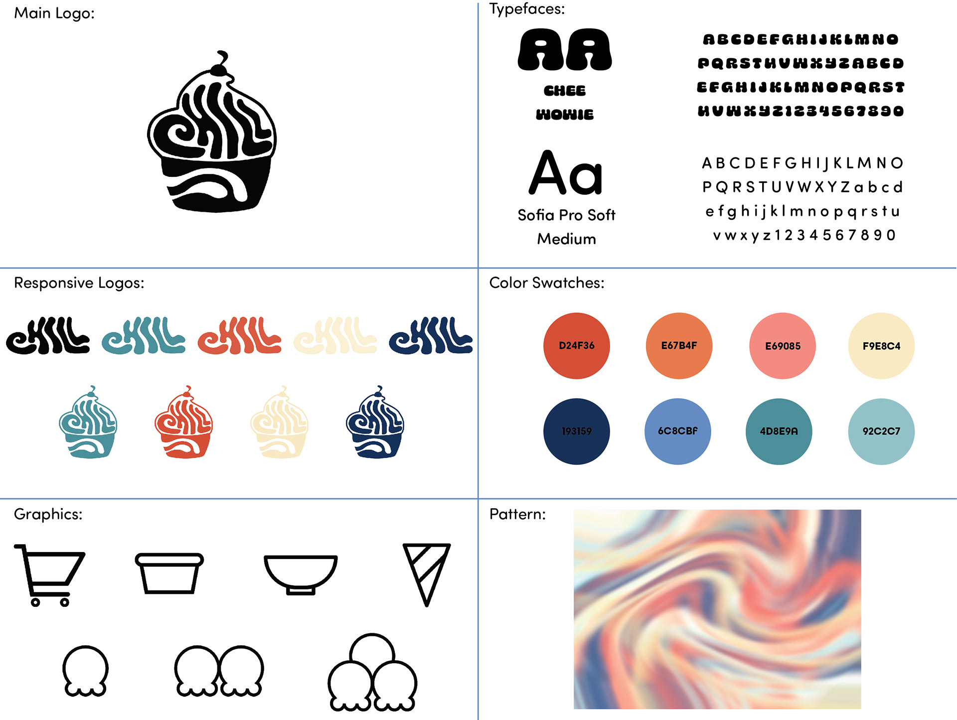
The first step in the project was to create a logo to see where we were heading with the identity of the restaurant. I started this part without having any specific direction for the design style of my restaurant, so the first ideas I presented were not working. My first logo ideas were based on a minimalist and typographic style approach that while it did look nice and was a cool idea, felt rigid, cramped, and ironically cold.
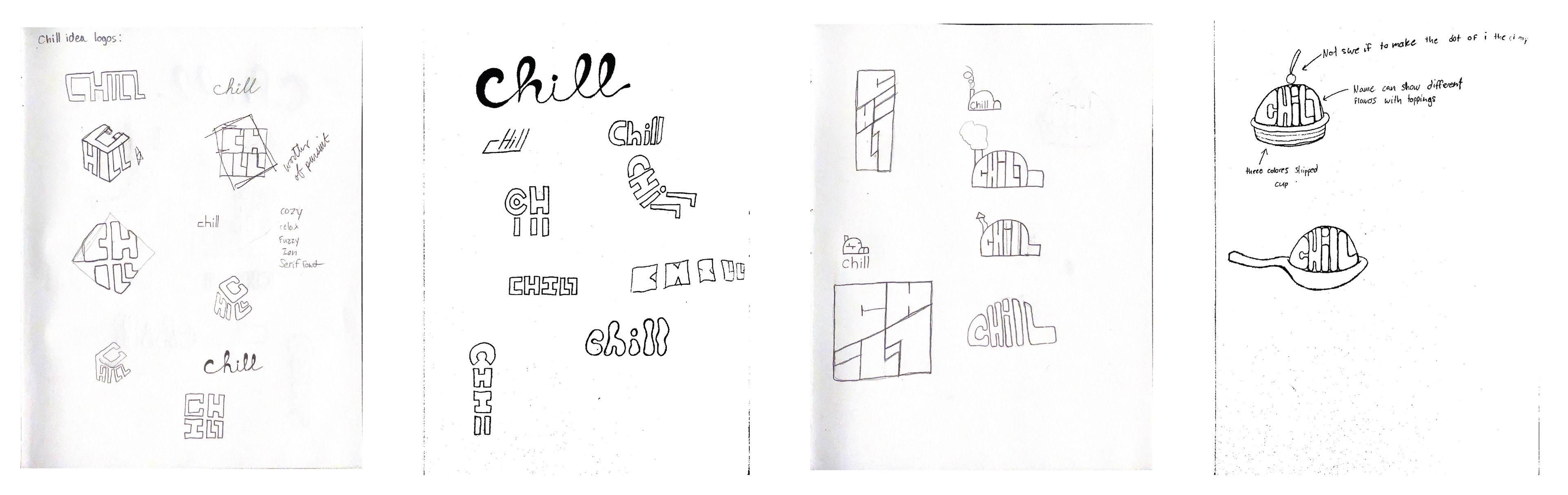
These attempts didn’t portray the concept and feeling that I wanted CHILL to have which was a cozy, fuzzy, and relaxing feeling. I went back to the drawing board and worked on different ideas and forms to see what I could come up with. There was a lot.
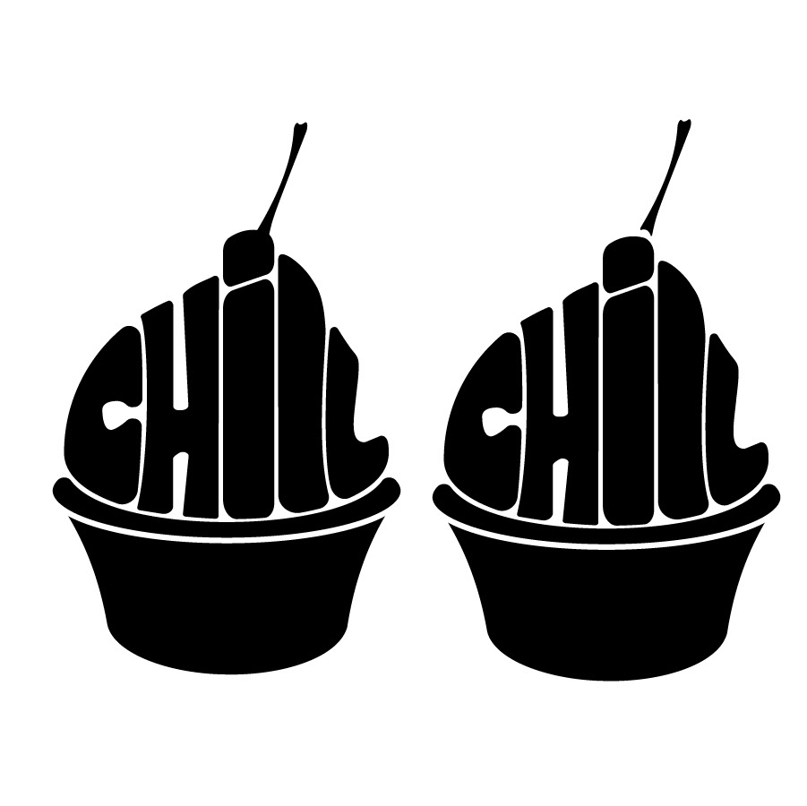
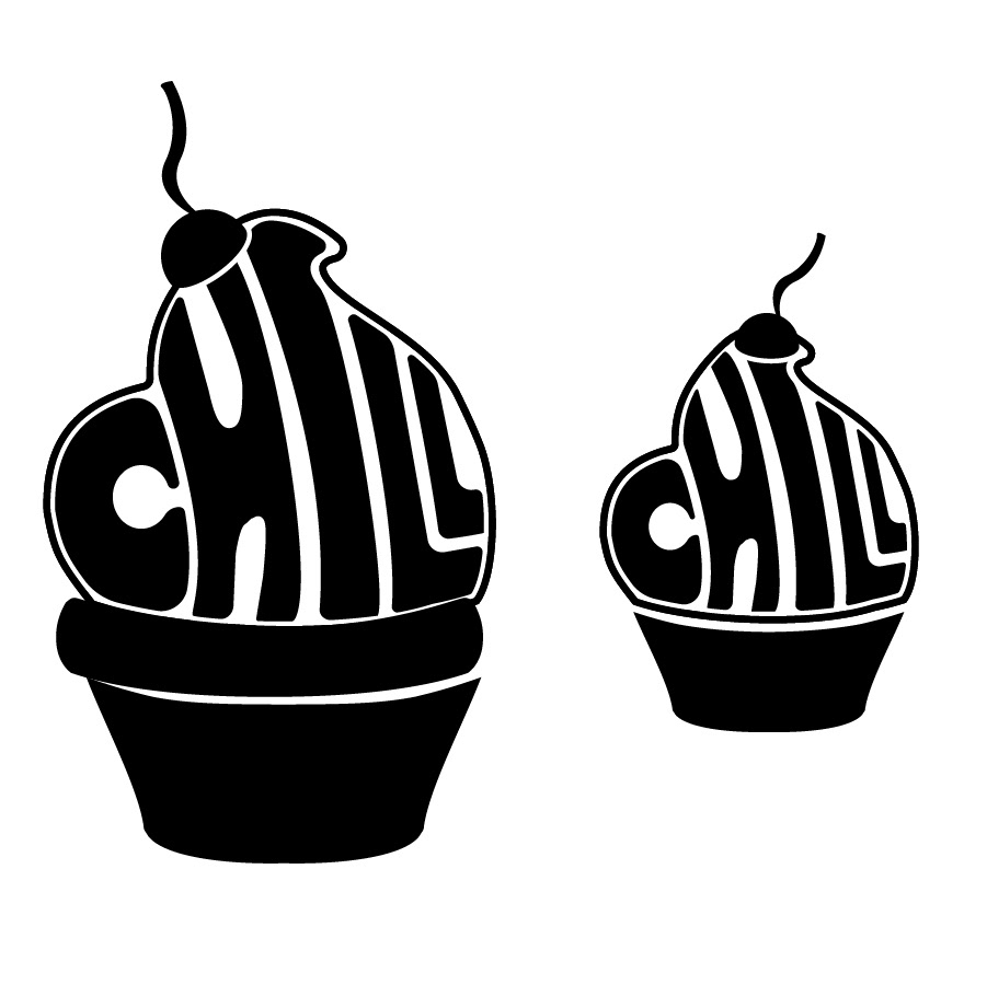
My professor directed me to work more on my mood boards to nail down the vibe that best fits the concept of the restaurant. I discovered and landed Psychedelic art as my inspiration because of the use of curves and chunky typography. Also in the research, it stated that psychedelic drugs can induce feelings of relaxation and overall well-being.
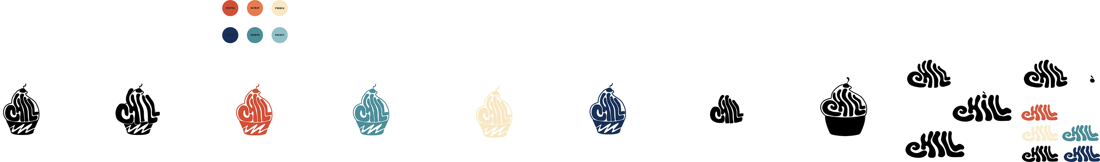
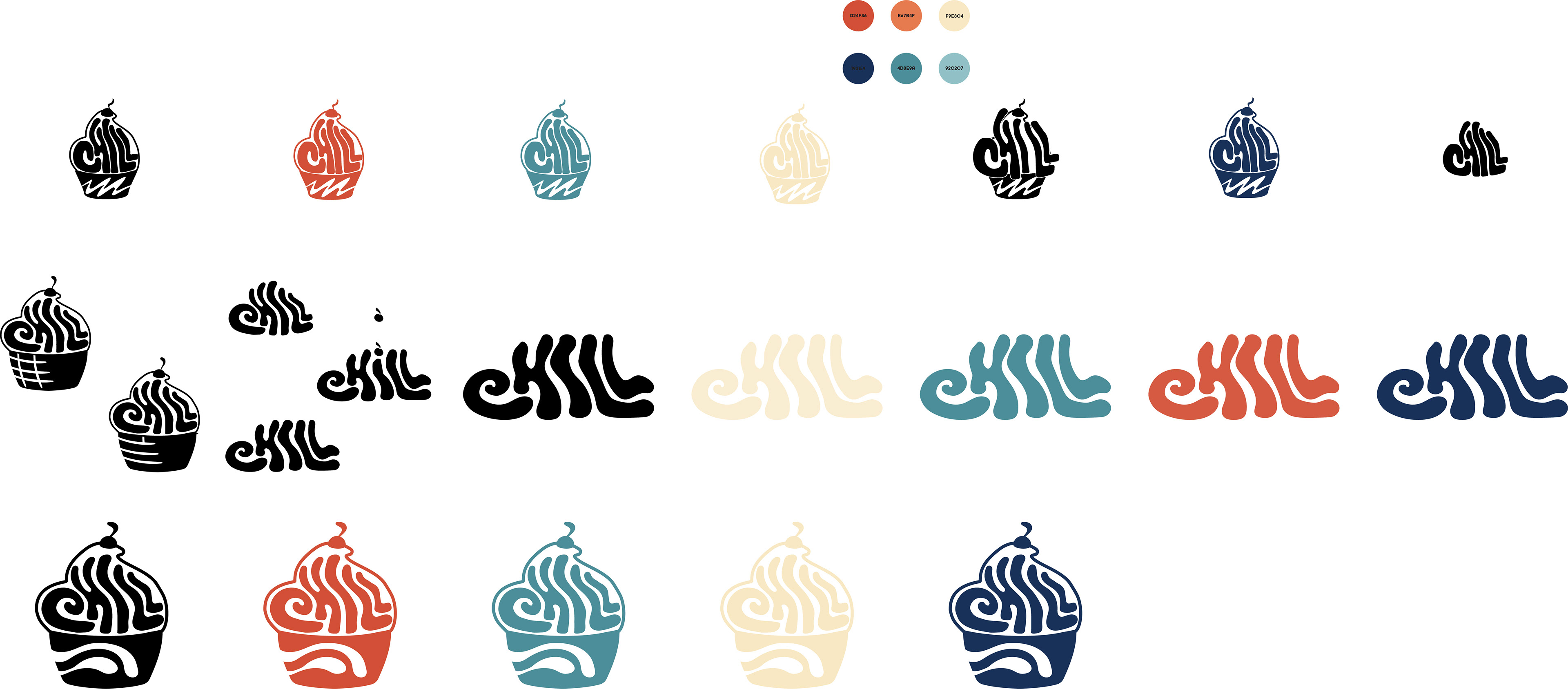
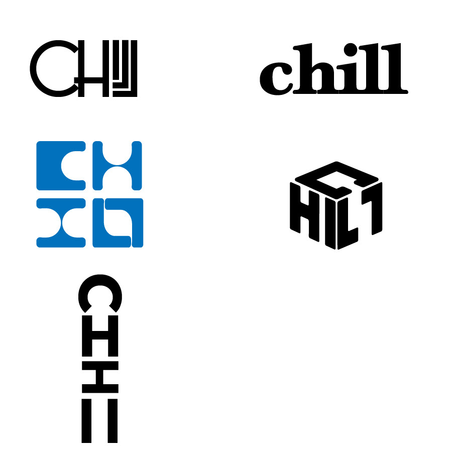
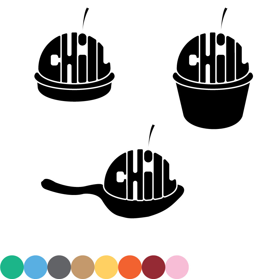
With the style in mind, my logo exploration was inspired by the squiggly letterforms and warped typography of the movement within a contained shape.


Feature Design
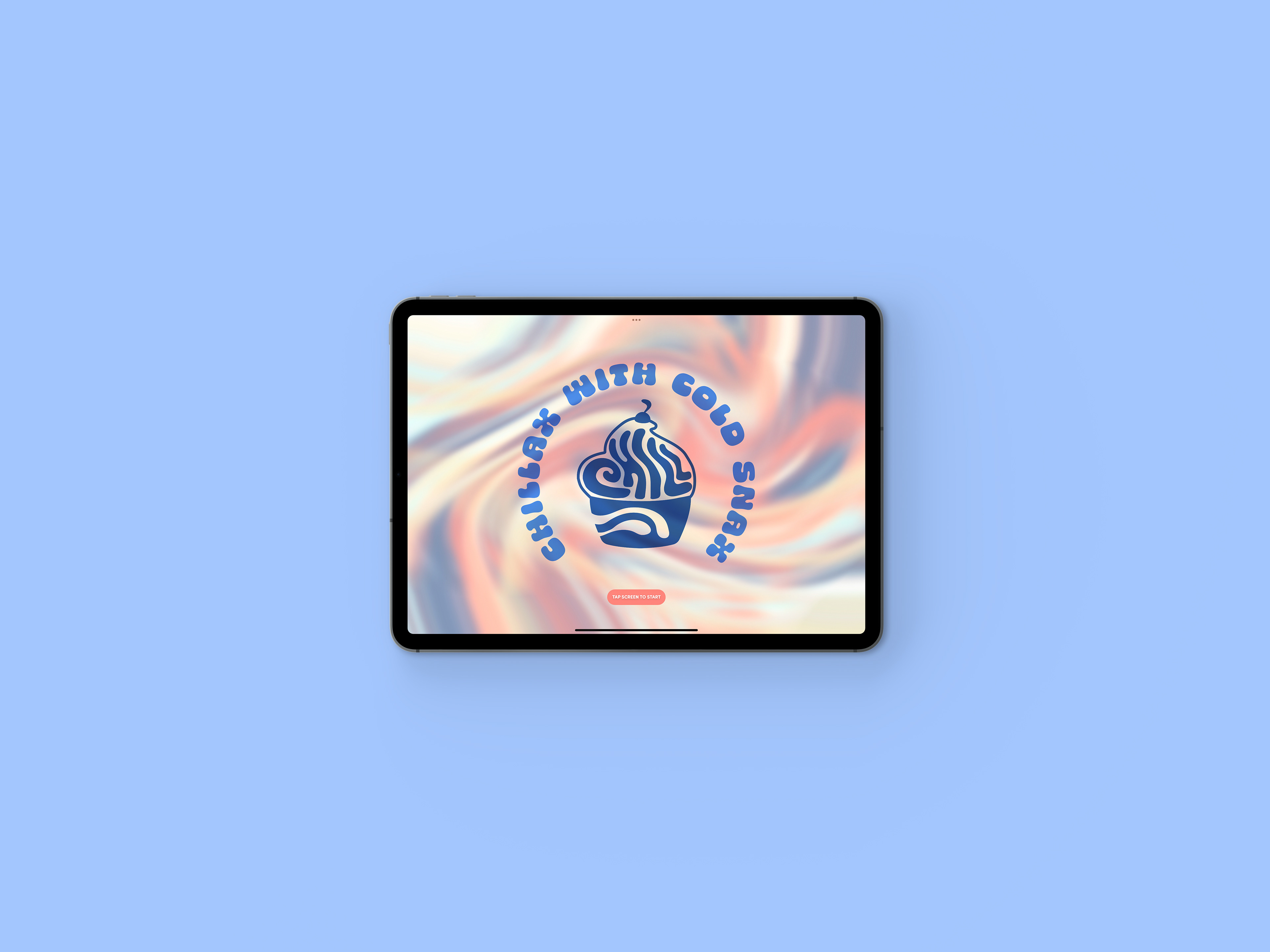
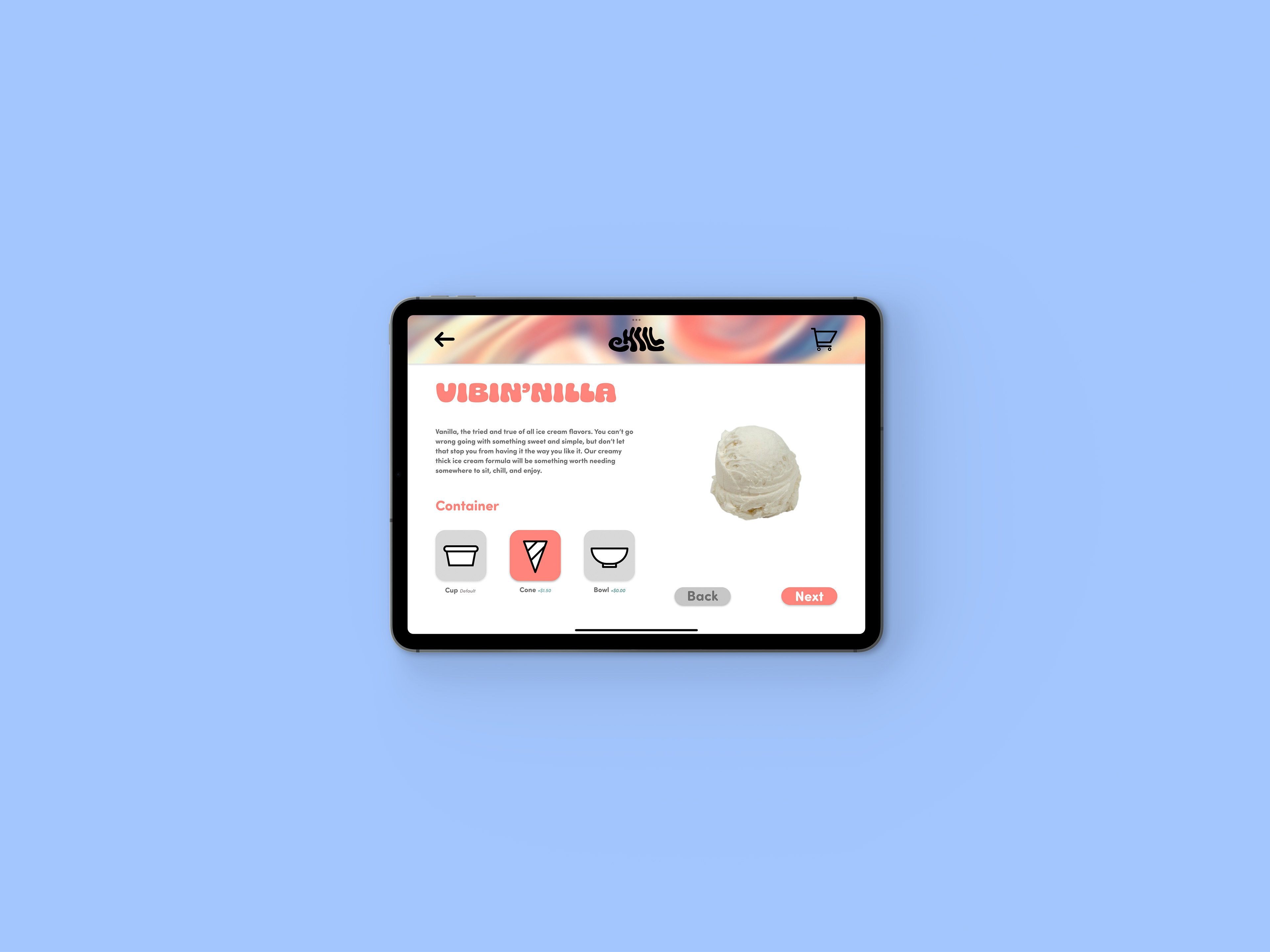
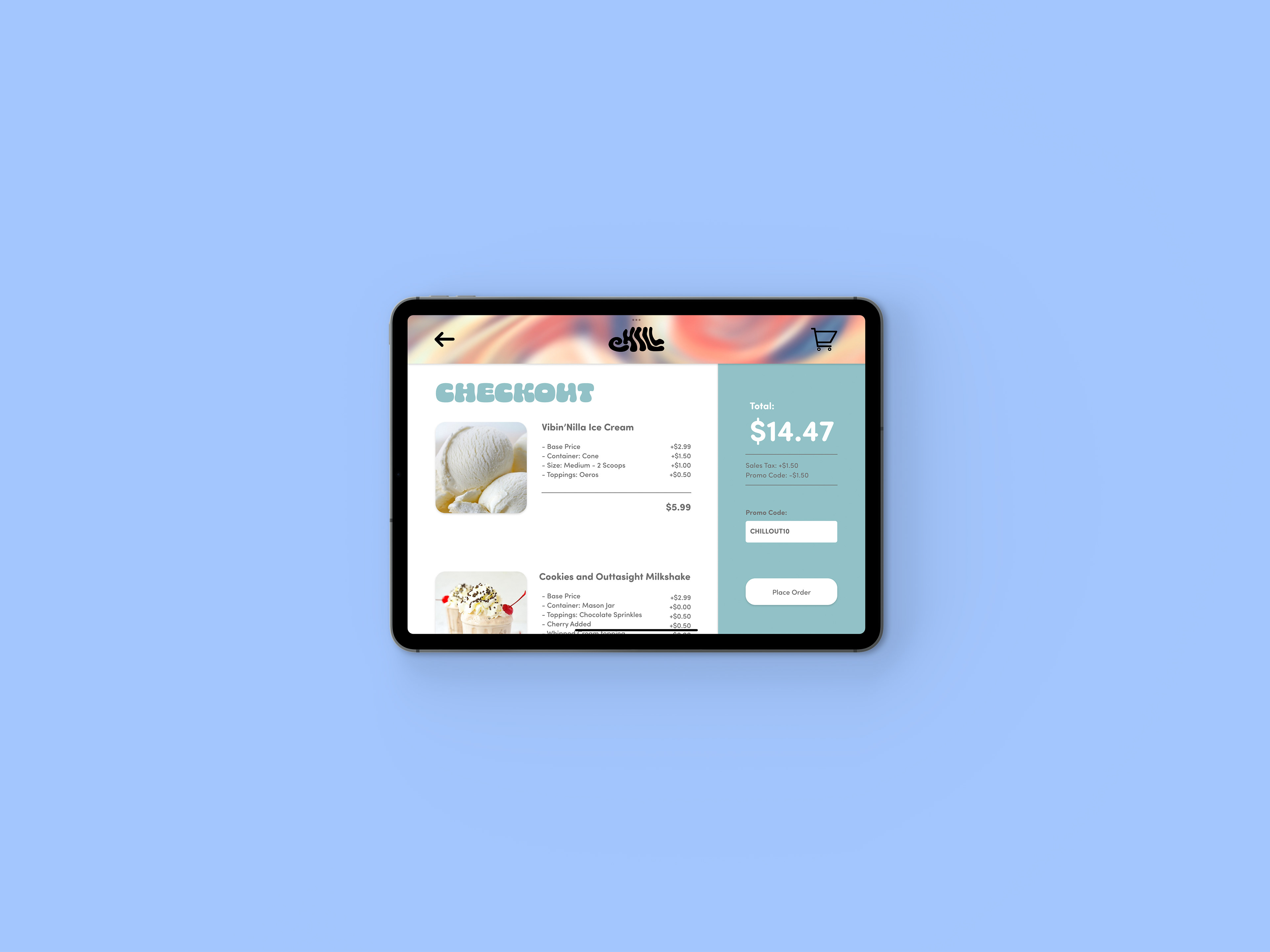
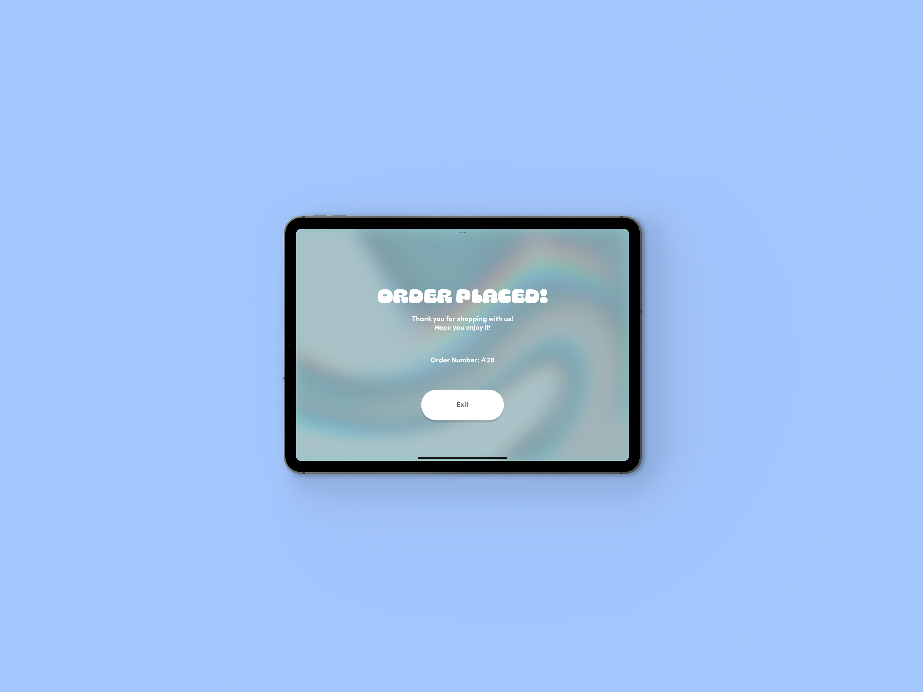
With the logo direction well underway, the project really started to take form. My next step was to decide on the form and create my feature design. I decided to go with a tablet menu ordering system that customers could use to order in-house. The reason I chose a tablet ordering system for my feature design was that it fit the idea of having a stress-free ordering experience at your own pace. Also, it’s less of a hassle as you can just come in, order, and then pick a seat and chill out while your order is being made. The tablet station would be located on stands on the counter near the entrance in CHILL.
Copywriting
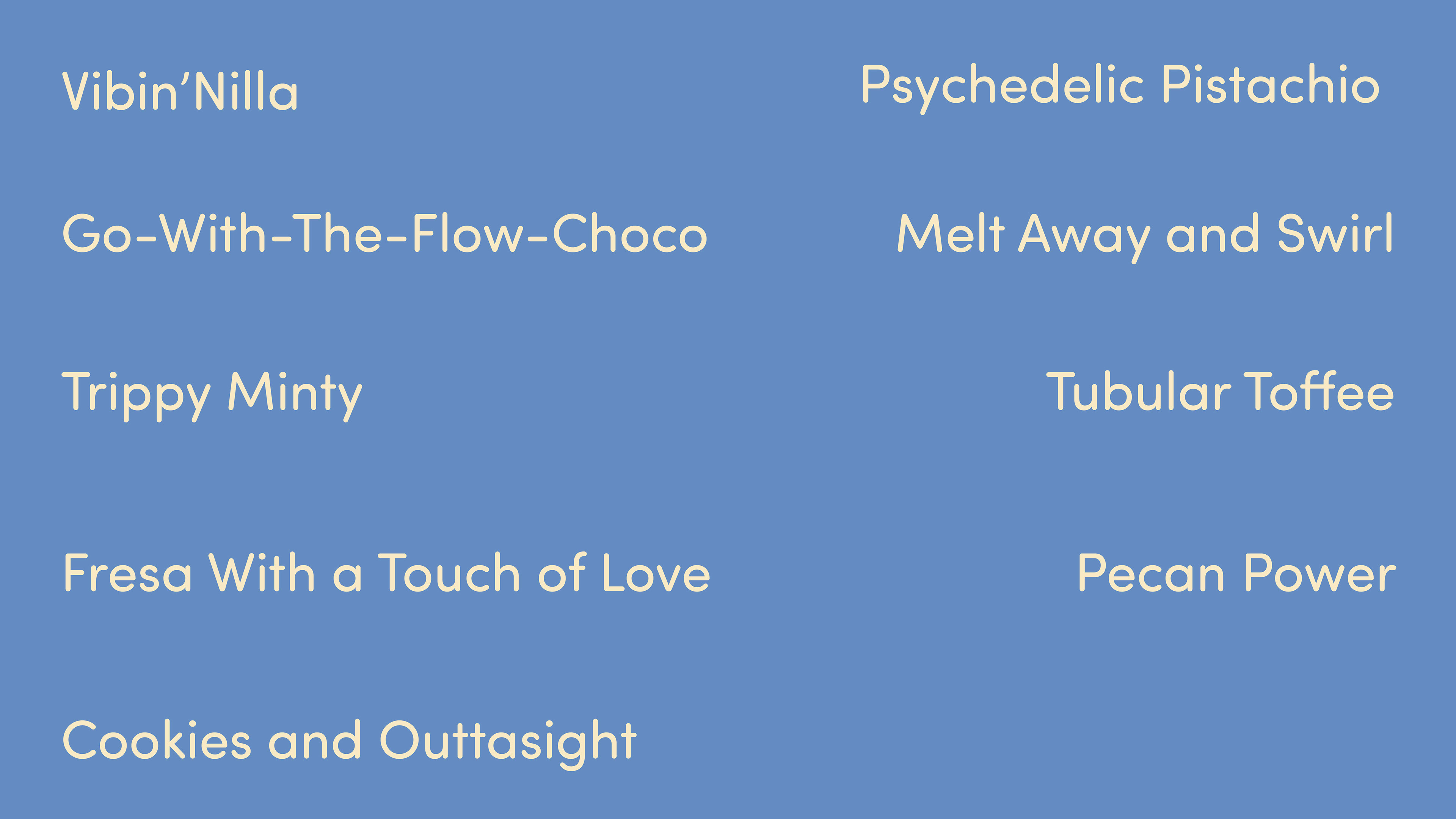
With the visual inspiration of CHILL established, the next step was to work on the verbal identity of the brand. I decided to portray the verbiage through the names of the ice cream flavors and have them follow phrases and keywords that are usually related to those who are either stoners, use psychedelics, or take part in surfing culture. Some of the keywords and phrases were: groovy, vibe, tubular, trippy, melt away, outtasight, and psychedelic. I also added a catchphrase that would go along with the restaurant which is “Chillax With Cold Snax.” I decided that this would mostly be used for visual detail on large spaces that would surround the CHILL logo and encase it to create an emblem logo.
Supporting Elements
The next step was to select and design the supporting elements to help further expand the brand identity. For these, I decided it made sense to focus on in-house and take-out packaging as that would be the main form in which the treats would be presented. I also thought it would be fun to design since I’m merging ice cream with psychedelic elements. The items I chose were a take-out ice cream pint, in-house ice cream/ frozen yogurt cups, take-out cookie boxes, an employee apron uniform, and a paper bag to carry out.
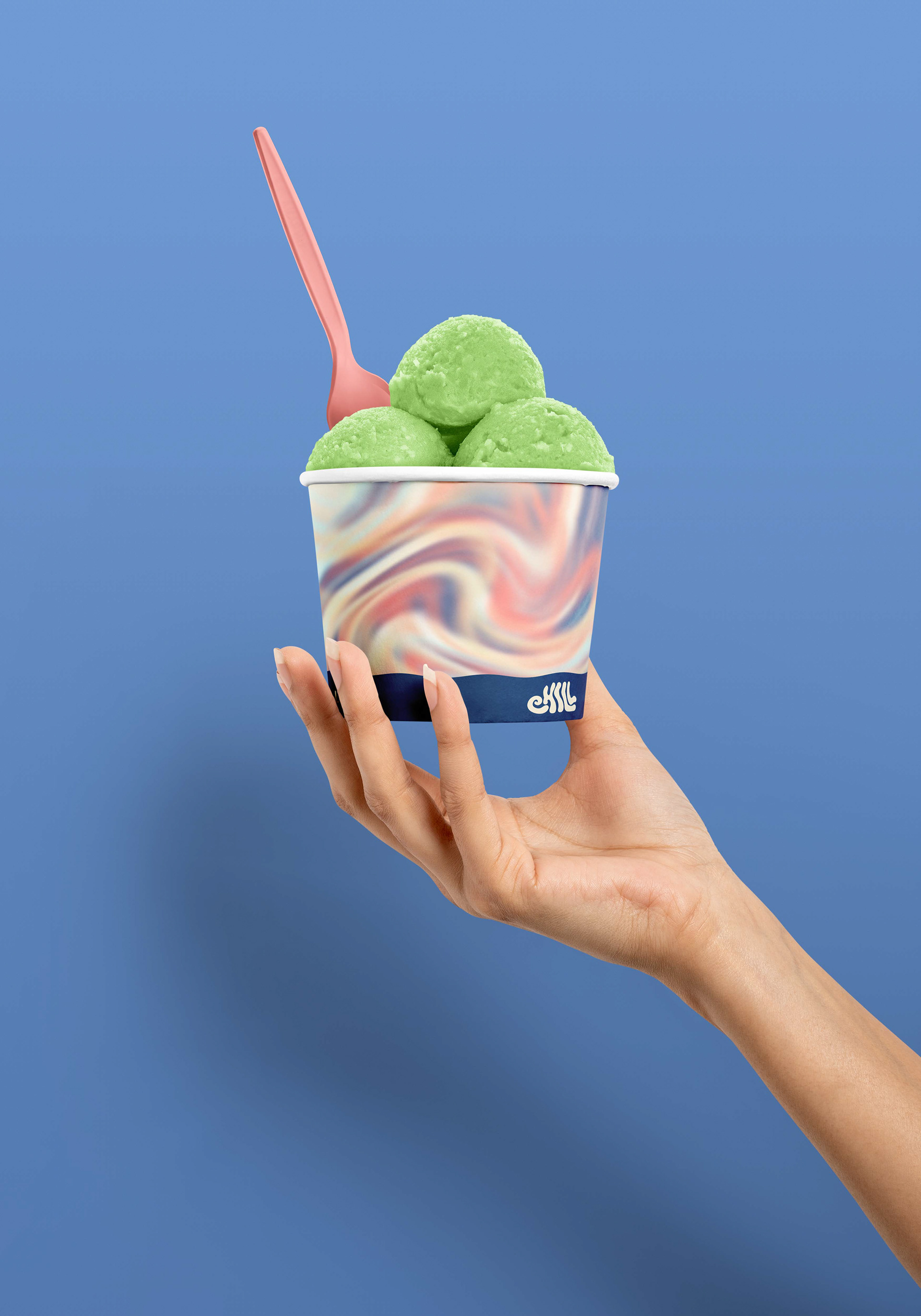
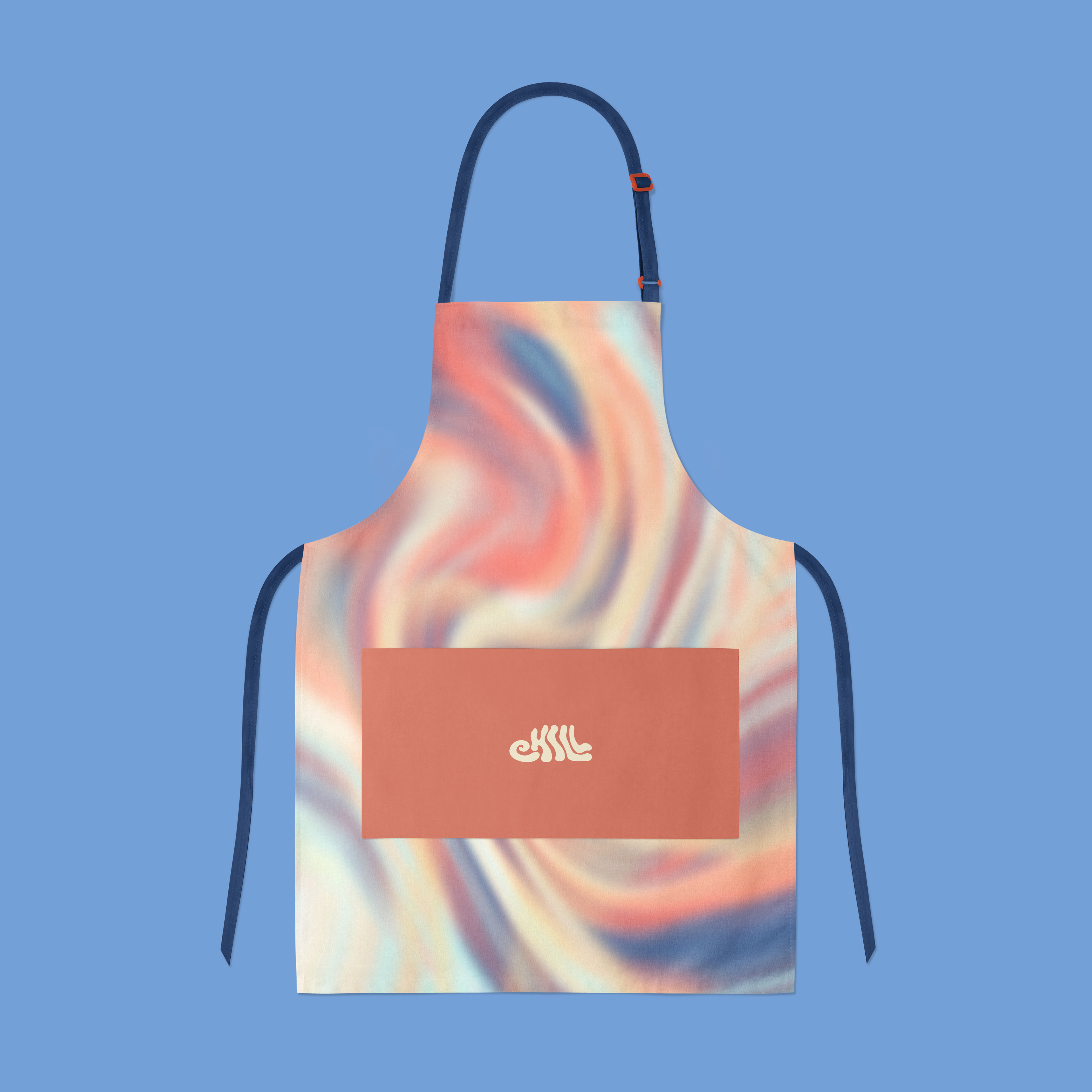
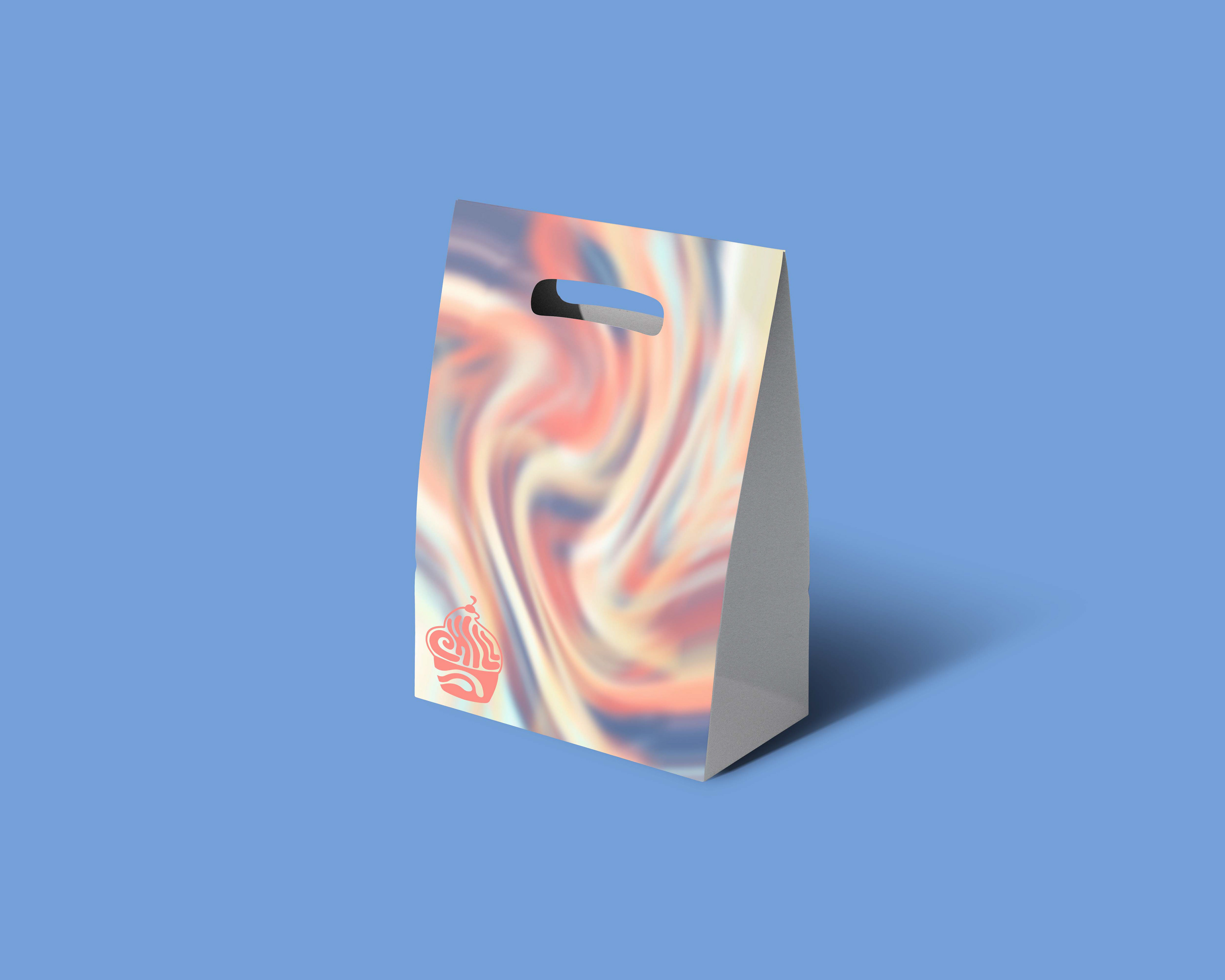
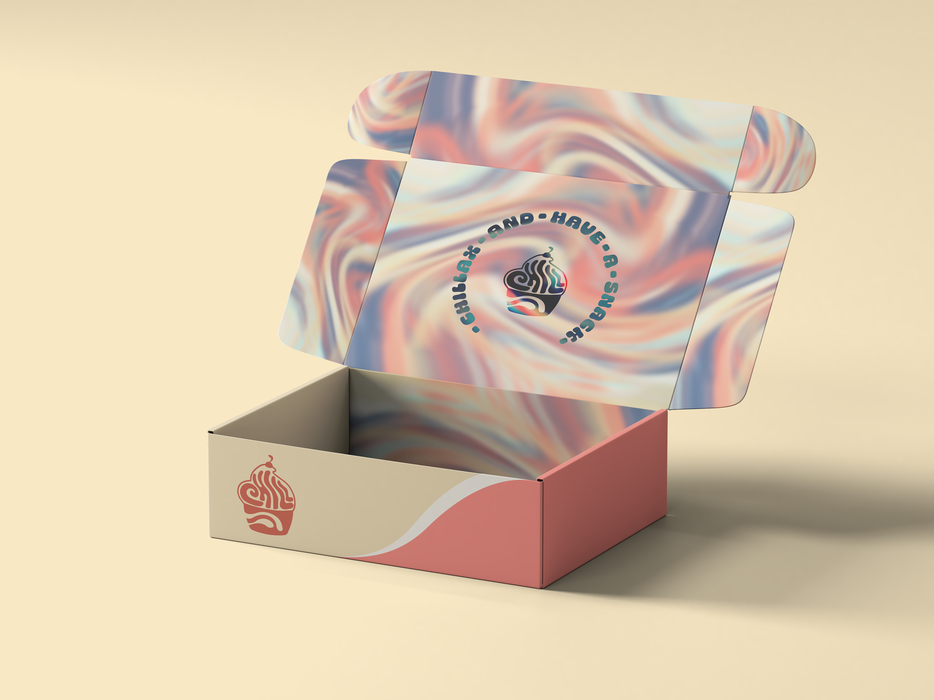
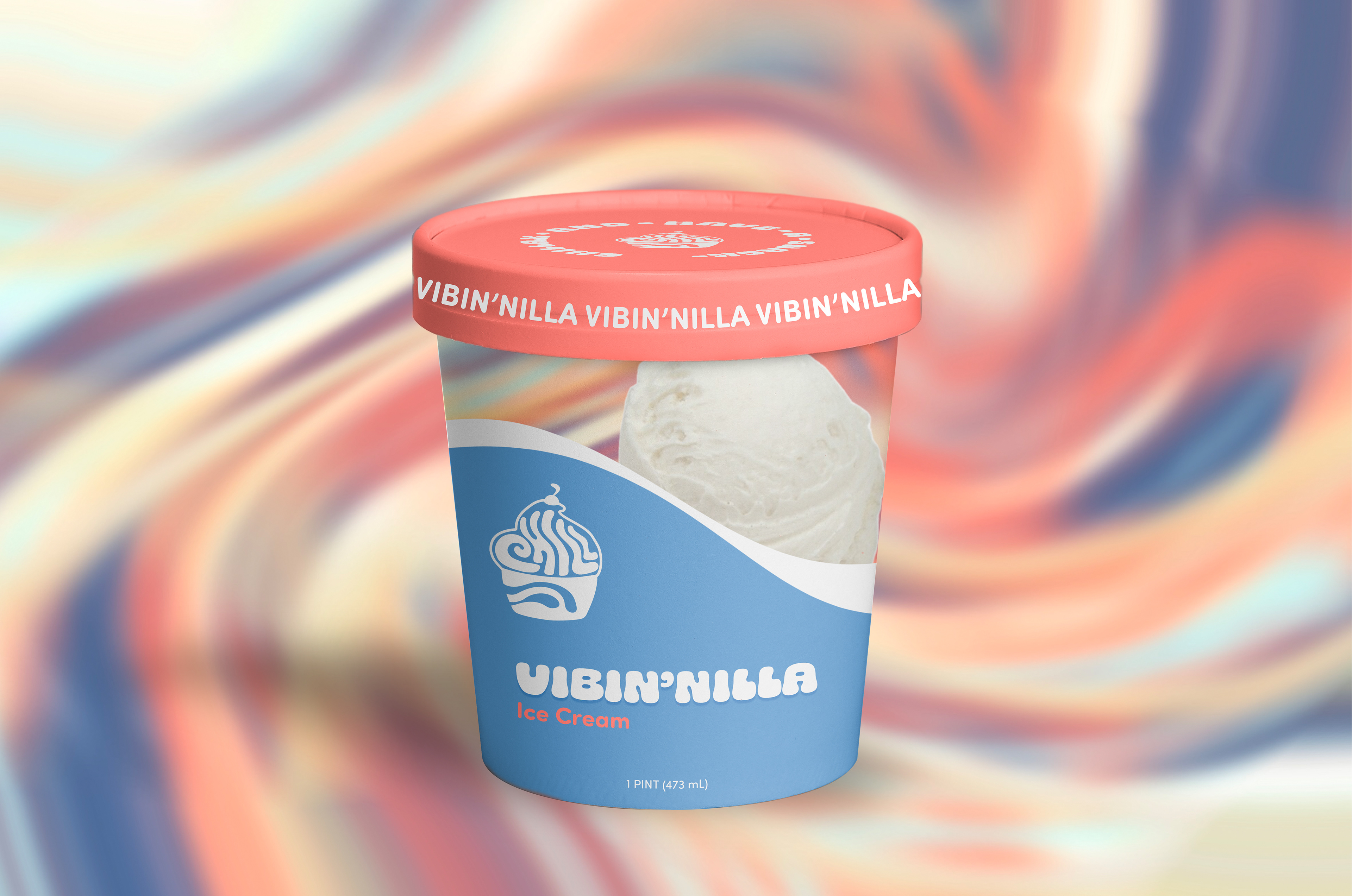
I unified the brand style with all of the elements by using a psychedelic pattern that I created in Procreate. The pattern, color palette, typography, and tone of writing were used to integrate all the deliverables together.

Environment
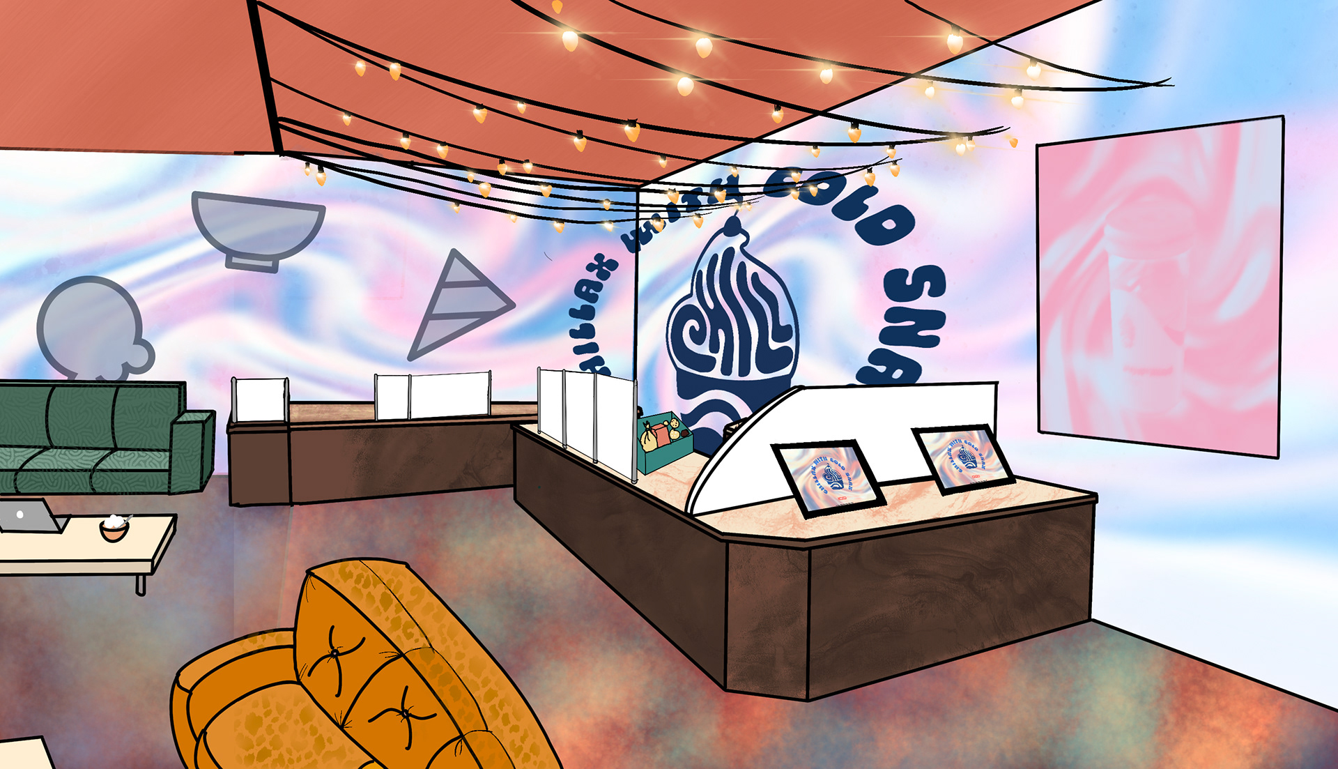
Another supporting element I chose was of an environmental setting mockup that I designed; in this element, I wanted to showcase the interior and style of CHILL. I mainly wanted to show the furniture and seating that is used because it’s meant to be a relaxing hangout lounge. I wanted the furniture to reflect that by using fluffy couches, comfortable cushion seats, and an open layout to create flow. Additionally, I wanted to show the tablet ordering station and where it would be located in the store. I designed a single-user flow for the ordering application that showcased how it would work.
Conclusion
In conclusion, this project was a very insightful and informative experience for me, I got to learn new things and skills as a designer. The challenge helped improve my design and thinking since it helped me understand how to organize and create something from the ground up and it also got me to go out of my comfort zone in terms of trying out new approaches.